By Agnieszka Gautier
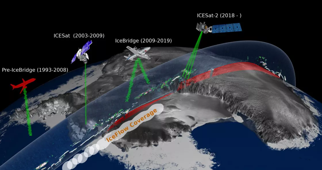
Lidar instruments have been mapping surface heights in Earth’s frozen regions—known as the cryosphere—since at least 1993, first on aircraft, and then from satellites. The altimetry data have provided evidence of Arctic sea ice thinning, the Greenland and Antarctic Ice Sheets losing mass, and glaciers dropping in volume. The challenge, however, has been the ability for data users and scientists to compare the collected data points in a time-series analysis.
The NASA National Snow and Ice Data Center Distributed Active Archive Center (NSIDC DAAC) offers a solution in the form of an interactive tool called IceFlow. IceFlow harmonizes and standardizes years of lidar data, so scientists can analyze significant changes using a uniform format.
What can IceFlow do?
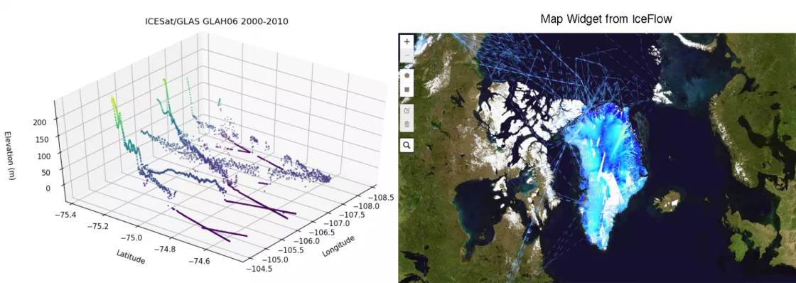
IceFlow uses a Jupyter notebook, an open-source web tool to provide the primary interface. It allows users to select data over both spatial and temporal ranges, order the data for download, and create data visualizations. This framework is widely used in the data science community.
For a user to engage with IceFlow, familiarity with Python and Jupyter notebooks is recommended. Novice data users can appreciate that the IceFlow notebook uses a map widget to access NSIDC’s Application Programming Interface (API). Hermes, as the NSIDC API is called, allows users to order data, check their order status, and download the results. Using the map widget, forgoes knowing the nuts and bolts of the API. For a more advanced user, this widget may be superfluous, but this way, the NSIDC DAAC offers a range of data access tools depending on a user’s skill level.
What data does IceFlow offer?
IceFlow’s python library simplifies accessing and combining cryospheric data from several of NASA’s altimetry missions from 1993 to present day, including the Ice, Cloud, and land Elevation Satellite (ICESat), Operation IceBridge, and ICESat-2. Currently, however, ICESat-2 is only accessible through IceFlow, but not harmonized like the older altimetry data.
ICESat-2 data can be directly accessed from the NSIDC DAAC, but getting the older Airborne Topographic Mapper (ATM) data has been challenging for scientists and data users. So, IceFlow stores the older ATM, ICESat, and Operation IceBridge data in a point-cloud database. In doing so, requested data can be extracted in an HDF5 format to directly access the older data rather than making users download original file formats. It means replacing an unwieldy file system with direct data points. Best of all, nothing needs to be downloaded or installed on the users’ personal computer because the data is stored in the cloud and can be interacted with on that level.
IceFlow’s fixin’s
NSIDC programmers needed to reconcile old and new geolocations within the ATM data. From 1993 to the present, Greenland has moved at least a meter from where it used to be. Earth’s crust shifts land masses at an average rate of 15 millimeters (0.6 inches) a year. Since the launch of ICESat, the International Terrestrial Reference Frame (ITRF), responsible for maintaining accuracy of the Earth’s surface, has been updated three times. IceFlow standardizes the coordinate reference systems and applies all geophysical corrections to the data. In the past, data users needed to do this task themselves.
With IceFlow’s map widget, a user can learn about the data, zoom in to format it, select any data from missions, add corrections, and choose a time frame to analyze data across the multi-decadal time series.
Down the line, the IceFlow team hopes to provide more manageable, yet accurate data. Users do not need the finest level of granularity to understand the overall change to Jakobshavn Glacier. For instance, if a single grid has 100 points in a meter, the data dissemination could do an average or offer half of the points because the big picture would not change, but the file size would be manageable.
That is the main goal in the end—to lower the barrier for data users and scientists, so they can do their research.
Access data through the NSIDC DAAC
NASA’s NSIDC DAAC manages, distributes, and supports a variety of cryospheric and climate-related datasets as one of the discipline-specific Earth Science Data and Information System (ESDIS) data centers within NASA’s Earth Science Data Systems (ESDS) Program. User Resources include data documentation, help articles, data tools, training, and on-demand user support. Learn more about NSIDC DAAC services.


