By Michon Scott
Depending on who is using the data and to what end, sea ice data can be misinterpreted and lead many to the wrong conclusions. On occasion, sea ice observations have even been shoehorned into disinformation campaigns about Earth’s climate and how it is changing.
Sea ice observations from satellites, aircraft, ship logs, and other historical records have enabled scientists to understand sea ice’s role on our planet and how sea ice is changing. Since the start of the continuous satellite record in November 1978, Arctic sea ice has exhibited a clear downward trend. Antarctic sea ice has exhibited little trend with extreme year-to-year variability over the same period. (Scientists are still examining the implications of a series of low extents in Antarctic sea ice.)
For decades, NASA and NOAA have relied on NSIDC to archive and distribute sea ice data to the science community. NSIDC’s Sea Ice Today has been one of the web’s best destinations for trustworthy, timely interpretation of sea ice observations and trends. Sea ice records at NSIDC and elsewhere agree with other indicators that climate is warming in response to fossil fuel burning. Still, many claims on social media and in fringe media outlets imply otherwise. These messages may seem compelling, but they are misleading, often by design. Here, NSIDC discusses five common misuses of sea ice data.
One: Comparing two or more points in time without mentioning what happened in between
Example: “Sea ice extent is higher now than it was 20 years ago.”
Rebuttal: This argument might sound convincing, but it likely leaves out most of the story.
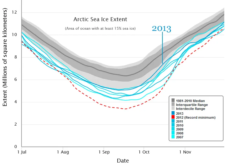
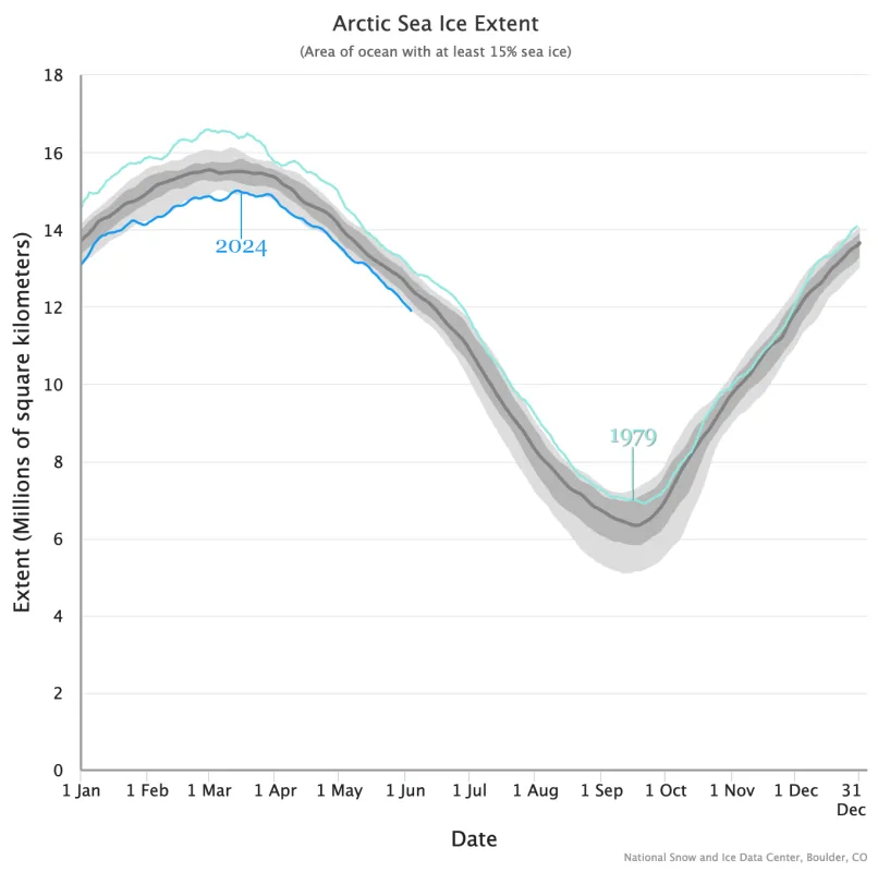
Using NSIDC’s Charctic tool, you can follow sea ice extent (the area of ocean with at least 15 percent sea ice concentration) over the course of the satellite record. The Charctic graph displays months of the year along the horizontal axis and extent (in millions of square kilometers) along the vertical axis. Every year gets its own, individual extent line.
In Charctic, you might occasionally find an instance where Arctic sea ice extent is higher on a particular day of a recent year than it was years before that. For example, around the time of the annual minimum in September, Arctic sea ice extent was higher in 2013 than it had been for nearly all years going back to 2007. The only year that came close was 2009. One might use these extent lines to argue that Arctic sea ice “recovered” in 2013, but Arctic sea ice extent fell below 2013’s value for nearly all years over the next decade. The Arctic sea ice minimum was just unusually high in 2013.
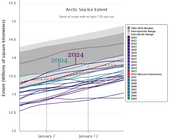
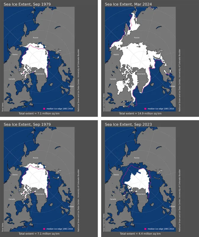
In an even more striking example, one could point to a brief stretch of time in January 2024, when Arctic sea ice extent was higher than it had been on the same days of the year in 2004. One could use isolated figures from January 2004 and 2024 to argue that Arctic sea ice extent stayed the same or even increased over the 2004 to 2024 time frame. That argument ignores the fact that early January Arctic sea ice extent was lower than 2004’s value in every other year between 2004 and 2024. It ignores the fact that 2024 extent values exceeded those of 20 years earlier for only a few days, and January’s monthly average extent was lower in 2024 than it was in 2004.
Both examples, which depend on isolated values, ignore the long-term trend in Arctic sea ice. The long-term trend is downward.
Long-term observations of Arctic sea ice extent show a decline related to climate change. A series of low Antarctic sea ice extents after 2016 suggests the possibility that Antarctic sea ice has recently begun responding to a warming signal, though more data are needed to be sure. Climate, however, is different from weather, which is also a significant driver of sea ice behavior on daily, monthly, and yearly timescales. Sea ice extent varies because of sunlight, ocean and air temperatures, winds, and storms. These factors will occasionally push sea ice extent above or below extents seen on the same day of the year in earlier years. Scouring the data record to find two data points to advance an argument that runs counter to what the experts have identified is a particular form of data misuse known as “cherry picking.”
Two: Comparing different seasons
Example: “Arctic sea ice extent is higher now than it was in all other years going back to 1979.”
Rebuttal: This argument might sound even more convincing than the one above. But if that comparison is made between different seasons, it is meaningless.
In both the Arctic and Antarctic, sea ice extent increases in the autumn and winter, and decreases in the spring and summer. Sea ice extent changes so much throughout the year that any comparison of sea ice extent between years is only meaningful if the comparison is made at the same time of year. It would be like saying that in the Northern Hemisphere, the average temperature in January 2024 was lower than the average temperature in August 1994. It’s comparing two very different seasons (and ignoring the fact that annual global temperature overall is quickly rising).
Caveat: Even when comparing the same season, it is still easy to cherry pick data. A comparison of Arctic sea ice extents across years will send a very different message depending on whether the comparison is, for instance, between the Septembers of 2023 and 1985 versus the Septembers of 2023 and 2012 (the record low). The most meaningful information comes from the long-term average. In Charctic, long-term (climatology) data appear as the dark gray median line and lighter gray bands around it. In extent and concentration maps, median values appear as color-coded outlines.
Three: Overemphasizing global figures
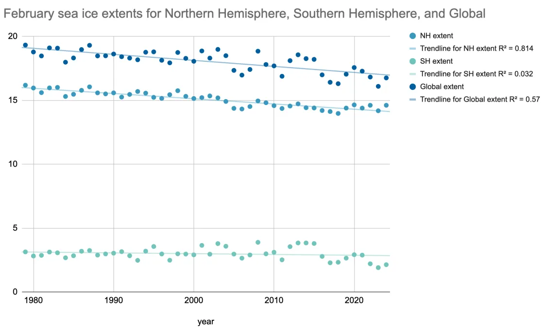
Example: “Global sea ice was roughly the same in February 2008 as it was in the Februarys of 2001, 1998, 1995, 1994, and 1980.”
Rebuttal: This statement could be used to challenge research showing ice losses over time. Besides cherry picking, this argument uses another questionable tactic: making broad inferences from global sea ice extent.
Global sea ice values are useful but nuanced. The Arctic and Antarctic are poles apart (pun intended), with opposing seasons and roughly opposite land-ocean arrangements. The Arctic is an ocean largely surrounded by land whereas the Antarctic is a continent surrounded by a vast ocean, and so their sea ice covers behave in very different ways.
In the Arctic, some sea ice persists throughout the summer at the highest latitudes. In winter, sea ice growth is constrained by surrounding coastlines. Climate change has reduced Arctic sea ice in part by lowering the region’s albedo, or solar reflection. Wamer temperatures have reduced springtime snow cover on nearby landmasses while declining Arctic sea ice has become a self-reinforcing cycle. Snow and sea ice declines have contributed to Arctic amplification: regional warming at least twice as fast as the global average, even faster in some areas.
In the Antarctic, sea ice exists at a lower latitude, along the Antarctic coastline, and often melts away completely in summer. In winter, nothing blocks sea ice from expanding. So, Antarctic sea ice experiences higher winter maximum extents and lower summer minimum extents than Arctic sea ice. Historically, natural climate cycles in the Southern Ocean, such as the Southern Annular Mode, appear to have played a bigger role in Antarctic sea ice behavior than climate change.
Because Antarctic sea ice has higher highs and lower lows than Arctic sea ice, the global total is dragged up and down largely by what happens in the Southern Hemisphere. So, simply tallying global sea ice numbers during select periods and relying solely on those numbers fails to tell the entire story. Climate does not exert identical impacts on Arctic and Antarctic sea ice extent. Arctic sea ice, which has been more closely tied to changing climate, has shown an unambiguous downward trend.
Four: Focusing on a short stretch in a long record
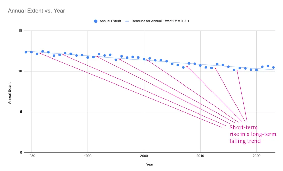
Example: “Annual Arctic sea ice extent is increasing.”
Rebuttal: A perceived increase in sea ice extent can easily be conjured by comparing just two or three years in a much longer record.
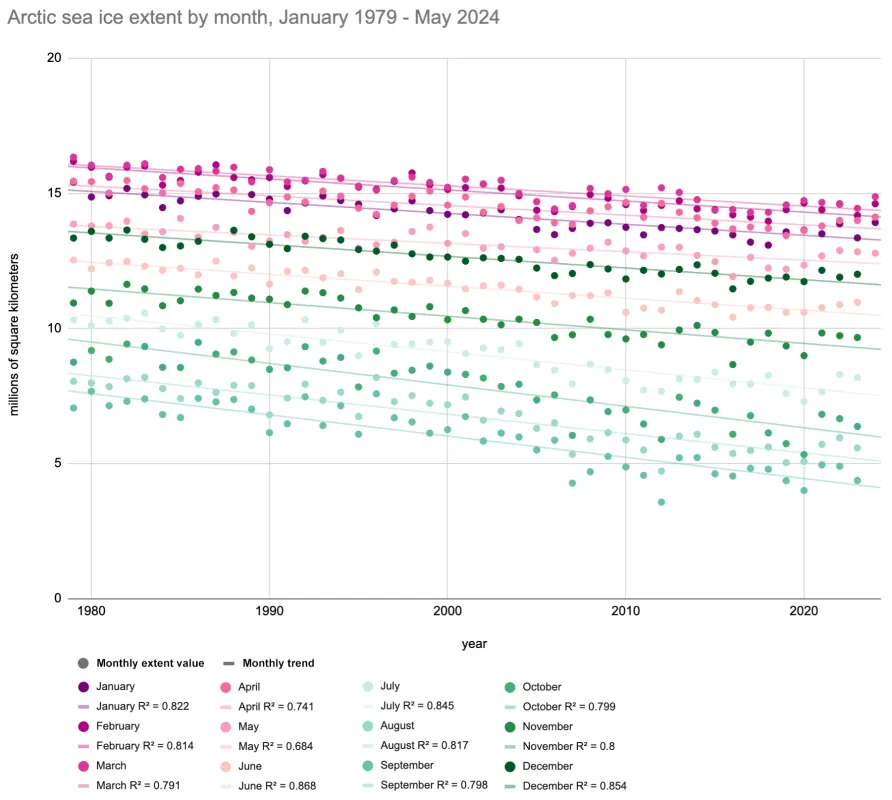
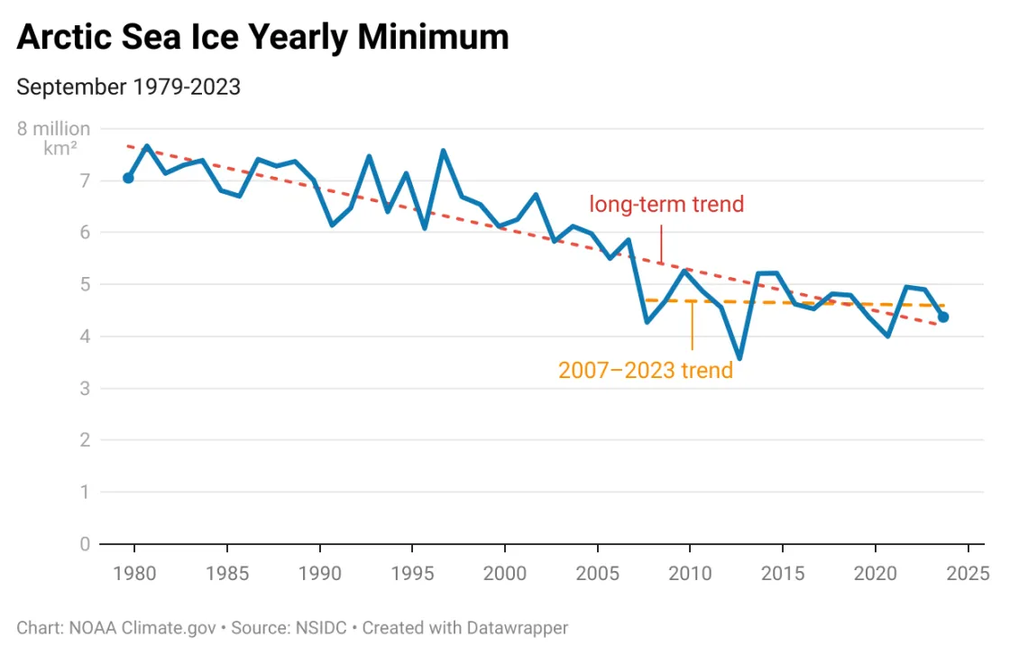
Any long-term data record will have ups and downs. By focusing on a short period, it is possible to paint a very misleading picture. In the example below, someone misusing the data could focus on the higher annual sea ice extents in 2008 compared to 2007, 2013 compared to 2012, 2017 compared to 2016, and so on. The more meaningful data come from looking at the long-term trend.
Caveat: It is not unreasonable to point out that some segments of the long-term record have different trends. But these should not distract from the "big picture” that sea ice extent is trending downwards.
Five: Discussing only one metric when others clearly apply
Example: “Sea ice has been growing rapidly this year since the annual minimum, so what’s the problem?”
Rebuttal: Sea ice often does grow rapidly in the autumn, but this is first-year ice. First-year ice is much less robust than older, thicker ice. Focusing purely on the growth of first-year ice while omitting sea ice thickness can mislead people unfamiliar with the topic.
In the Antarctic, nearly all ice is first-year ice since sea ice melts back to the Antarctic coastline in many places. In the Arctic, by contrast, some sea ice has historically survived multiple melt seasons, in places growing as thick as a one-story house. The amount of Arctic sea ice surviving multiple melt seasons has declined, not only since the start of the satellite record in November 1978, but also since the start of the twenty-first century. Younger, thinner sea ice is more likely to melt and/or break up in storms. The all-around greater vulnerability of a younger, thinner ice pack means it is less likely to persist. It is also a less suitable habitat for animals that depend on it. Polar bears deprived of thick, sturdy multiyear ice, for instance, must swim much greater distances to hunt, and may wander onto land, where they find less nutritious food, and where humans would be better off not meeting polar bears.
The animation above shows sea ice age in the Arctic Ocean, from 2000 to 2023. Observations are from early September each year, generally the week before Arctic sea ice reaches its annual minimum extent. Oldest, thickest ice is white. Youngest, thinnest ice is dark blue. —Credit: NOAA Climate.gov based on data from NSIDC
Don’t be fooled
Sea ice data can be misunderstood or even intentionally used to mislead people unfamiliar with the subject. Anticipating every possible misuse of sea ice data can be challenging, especially when you already have a busy life. A reliable method for avoiding being misled is to look at the data in context and look for long-term trends.
