Ice Sheets Today
About the data
The daily Greenland melt maps and graphs and periodic Antarctic melt images displayed on Ice Sheets Today are near-real-time images derived from gridded brightness temperatures (TBs) from the Defense Meteorological Satellite Program (DMSP) Special Sensor Microwave Imager/Sounder (SSMIS) passive microwave radiometer.
Known data issues
Unfortunately, the SSMIS source data for the Greenland Ice Sheet images has not been available since Sep 24 - first due to a power failure where the data are downloaded and now potentially due to the federal government shutdown. At this time, we are not sure when these images will return to updating daily.
How often do the images update?
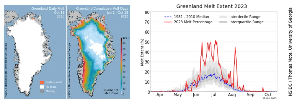
- Greenland images are processed daily during the Greenland melt season to display a daily melt map, a cumulative melt days map and a cumulative melt extent graph.
- Visitors may notice that the date on the image is occasionally more than one day behind. This is likely due to short-term delays and data outages that are usually resolved in a few days.
- Antarctic ice sheet images are processed periodically during the Antarctic melt season and typically include a cumulative melt map of Antarctica, a cumulative melt map of the Antarctic peninsula, and an Antarctic cumulative melt extent graph.
Interpreting the Greenland melt images
The Greenland daily images include two maps and one graph and are displayed on the homepage of the Ice Sheets Today site during the Greenland melt season (typically April 1 to November 1). Melt images include an observation date that dynamically updates as the data refresh. Typically, images are updated daily, with a one-day lag. Sometimes, data delays do occur. Images are also featured in melt analysis articles alongside additional data visualizations communicating current conditions.
Greenland daily melt map: This map displays where surface melt occurred on the Greenland Ice Sheet on that day. Orange areas indicate surface melt and the white areas indicate no melt.
Greenland cumulative melt days map: This map displays how long areas of the Greenland Ice Sheet have been melting to date through the current melt season. The colors on this map indicate which areas have had more or fewer melt days and range from white, which represents no melt, to dark red, which represents 100+ days of melt. Note that this differs slightly from the Antarctic Ice Sheet color code.
Grey represents areas of missing data on both maps. This includes areas along the coast that are masked out because the satellite sensor’s resolution is not fine enough to distinguish ice from land when a pixel overlaps the coast. Note that the northeast coast (northern Peary Land and Kronprins Christian Land) currently shows erroneous melt pixels. This is a false melt signal from seasonal snow and patchy ice areas, where our method of determining surface melting does not work. This issue does not affect trends for the entire ice sheet. We are working to improve the ice sheet mask.
Greenland melt extent graph: This graph indicates surface melt as a percentage of the ice sheet area across the year and compares the current year to previous years of data. In the time series graph, we account for missing data by averaging the extent for that region from the day before and the day after the gap, a mathematical technique called interpolation. Additional data on the graph include the climatological average in blue. The interquartile and interdecile ranges appear in gray bands.
Interpreting the Antarctic melt images
The Antarctic daily images include two maps and one graph and are processed periodically during the Antarctic melt season (typically November 1 to April 1). Melt images include a date range of observations that dynamically updates as the data refresh. These images are featured in our monthly analysis articles and on the homepage of Ice Sheets Today.
Antarctic cumulative melt days map: This map displays how long areas of the Antarctic Ice Sheet have been melting to date through the current melt season. The colors on this map indicate which areas have had more or fewer melt days and range from white, which represents no melt, to dark red, which represents 80+ days of melt. Note that this differs slightly from the Greenland Ice Sheet color code.
Antarctic peninsula cumulative melt days map: This map displays how long areas of the ice sheet on the Antarctic peninsula have been melting to date through the current melt season. The colors on this map indicate which areas have had more or fewer melt days and range from white, which represents no melt, to dark red, which represents 80+ days of melt.
Antarctic melt extent graph: This graph indicates surface melt as a percentage of the ice sheet area for the same time period as the melt maps. Additional data on the graph include the climatological average in blue. The interquartile and interdecile ranges appear in gray bands.
How are the images created?
The data used by this project are based on the freely available data set Near-Real-Time DMSP SSM/I-SSMIS Daily Polar Gridded Brightness Temperatures available from the NASA National Snow and Ice Data Center Distributed Active Archive Center (NSIDC DAAC).
- The brightness temperatures visualized in Ice Sheets Today are calculated for each 25-kilometer grid cell.
- An algorithm is applied to produce an estimate of melt or no melt present for each grid cell.
- Thomas Mote at the University of Georgia provides daily Greenland Ice Sheet melt data
- Antarctic Ice Sheet melt data are processed at NSIDC, based on the original algorithm by Thomas Mote that was adapted for the Antarctic Ice Sheet by Mike MacFerrin at the Cooperative Institute of Research in Environmental Sciences (CIRES).
- Elizabeth Cassano and Matthew Fisher at NSIDC also contributed to the software development.
Other resources
Polar Portal: Monitoring ice and climate in the Arctic
Jason Box, Geological Survey of Denmark and Greenland (GEUS)
Greenland melt season model simulations
Xavier Fettweis, University of Liège, Belgium
