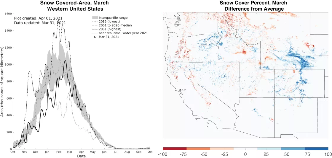
- Since our last post in March, snow-covered area in the western United States declined from its peak in February.
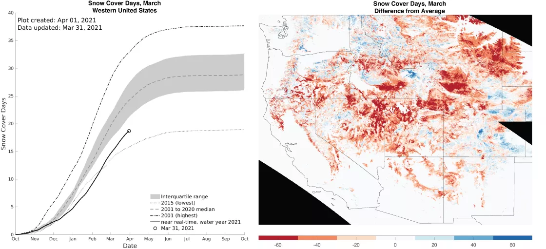
- Significant storms in March thwarted setting a new record minimum for snow cover days, which was set in 2015.
- Large storms in Colorado and Wyoming increased snow cover to above average conditions.
- States and large river basins of the West had near-average, snow-covered area for March with the exception of Nebraska and the Arkansas-White-Red, which were above average.
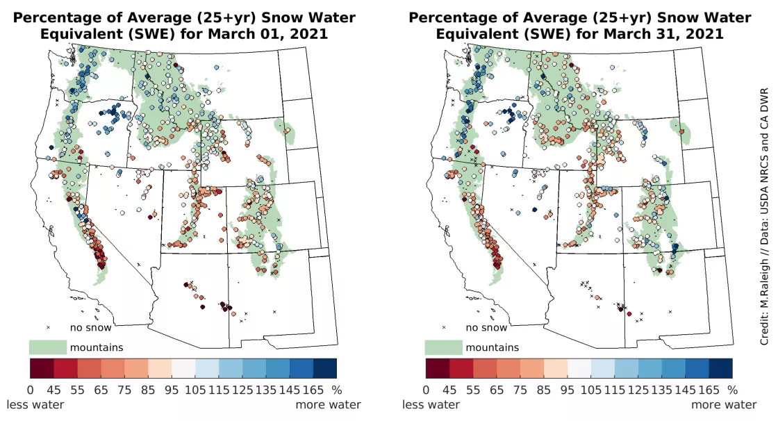
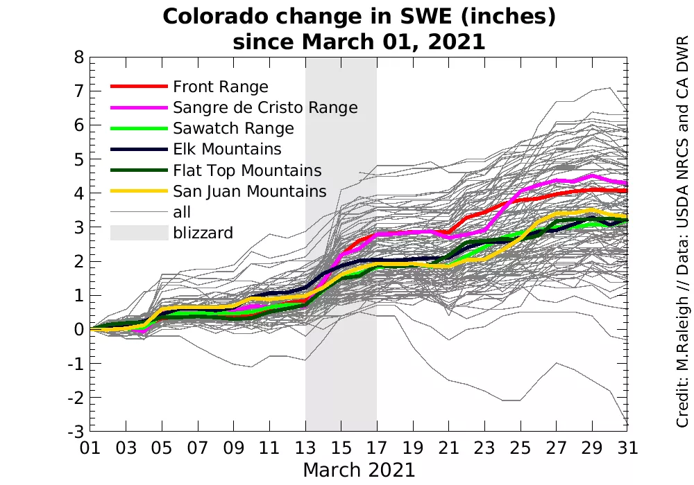
- For snow water equivalent (SWE), the prevailing La Niña pattern persisted through March, with above average SWE in the north and below average SWE in the south. A blizzard in mid-March brought widespread and deep snow to the Denver area but only half as much snowfall to mountain ranges in Colorado.
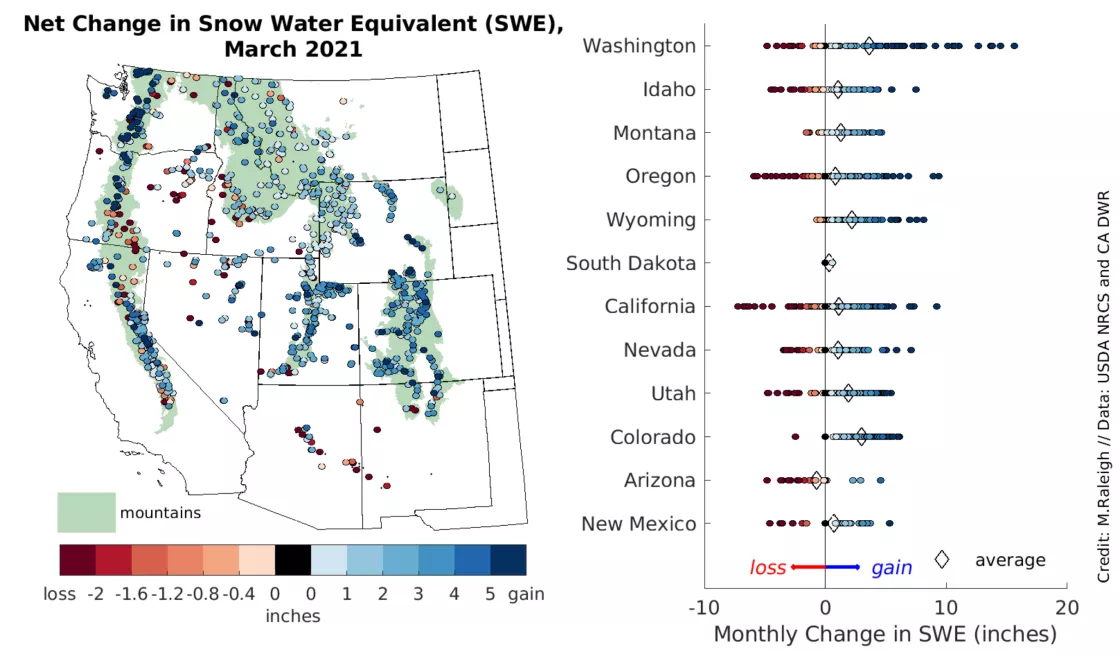
- Washington, Colorado, and Wyoming had the largest increases in SWE during March.
- SWE station data show where maximum SWE typically occurs before and after April 1.
Overview of conditions
| Snow-Covered Area | Square Kilometers | Square Miles | Rank |
|---|---|---|---|
| 2021 | 643,000 | 248,000 | 13 |
| 2001 to 2019, Average | 663,000 | 256,000 | -- |
| 2019, Highest | 1.05 million | 405,000 | 1 |
| 2015, Lowest | 362,000 | 140,000 | 21 |
| 2020, Last Year | 627,000 | 242,000 | 14 |
Snow-covered area for the western United States averaged for March 2021 was just 20,000 square kilometers (8,000 square miles) below the 2001 to 2019 satellite average, bringing conditions to 97 percent of average, an improvement from conditions in February (Table 1). Snow-covered area in March 2021 was 16,000 square kilometers (6,000 square miles) greater than March 2020. Snow-covered area was nearly twice that of the lowest year (2015) and more than half that of the highest year (2019).
Snow-covered area was above average in eight of the thirteen states in our analysis region (Table 2). Storms in Nebraska raised the snow-covered area, but as that new snow melted, conditions returned to average by the end of March. While last month’s post showed all Hydrologic Unit Code 2 (HUC2) basins had less than typical snow cover, the combination of storms and a slow decrease in snow-covered area resulted in half of the basins in the western United States with above average snow-covered area. Similar to Nebraska, the Arkansas-White-Red basin received storms that significantly raised snow-covered area but returned to average at the end of March.
| HUC2 Basin | Percent of Average | State | Percent of Average |
|---|---|---|---|
| Pacific Northwest | 96 percent | Arizona | 114 percent |
| Great Basin | 98 percent | California | 92 percent |
| Lower Colorado | 98 percent | Colorado | 117 percent |
| Upper Colorado | 105 percent | Idaho | 93 percent |
| Rio Grande | 119 percent | Montana | 77 percent |
| Arkansas-White-Red | 149 percent | Nebraska* | 297 percent |
| Missouri | 101 percent | Nevada | 107 percent |
| California | 92 percent | New Mexico | 128 percent |
| Oregon | 104 percent | ||
| South Dakota | 120 percent | ||
| Utah | 96 percent | ||
| Washington | 97 percent | ||
| Wyoming | 123 percent | ||
* These values returned to average by the end of the month.
Conditions in context: snow cover
Snow-covered area for the 2020 to 2021 water year is near average as assessed over the satellite record, which began in 2001. While snow cover reached a maximum for the year in February, the monthly maximum for March peaked during the middle of the month, fueled by a series of storms. Dry conditions followed, leading to a decrease in snow-covered area at the end of the month (Figure 1, left). While earlier in the year all states had widespread areas of below average snow cover, March snow cover patterns had both positive and negative differences from average (Figure 1, right).
Typically, snow-covered area peaks in February, after which snow cover is less likely at warmer, lower elevations. As a result, large regions across the western United States show no substantial deviation from average snow cover conditions as all values are near zero (Figure 1, right). In March, snow cover remains at mid to upper elevations where seasonal snowpack persists well into spring. Colorado and Wyoming now have more snow-covered area than average, as do much of Nevada, northeast Oregon, and the central eastern and western parts of Idaho. Much of California’s Sierra Nevada still has below average snow cover but the differences are less pronounced than in previous months. Northern Montana now has below average snow cover, while the southern part of the state recovered from below average conditions.
In contrast to snow-covered area, snow cover days, which accumulate over the water year beginning on October 1, remain well below average (Figure 2, left). However, the combination of March storms and a fairly slow decrease in snow cover resulted in snow cover days recovering from a near record low over the 21-year satellite record. Still, snow cover days remain well below average in large regions of the western United States (Figure 2, right). This late in the snow season, it is unlikely that snow cover days will reach average, as higher temperatures often result in rain instead of snow at lower elevations. However, at higher elevations, storms could still bring snow cover days closer to average, especially if spring snowfall and/or slower melt cause snow to persist.
Conditions in context: snow water equivalent (SWE)
Across the western United States, patterns in snow water equivalent (SWE)—the amount of water stored as snowpack—were similar at the start and end of March 2021 (Figure 3). The signature of the La Niña seasonal climate pattern on the snowpack continued through March, with above average SWE in northern locations and below average SWE in southern locations. In the Pacific Northwest, the Cascades maintained above average SWE, with several locations in Oregon moving to above average SWE. Farther inland, Idaho and Montana had several regions that switched from average to below average SWE. In the Sierra Nevada the north-south contrast in SWE seen in previous months persisted, with near average SWE in the north and low SWE to the south. In Arizona and southwest New Mexico, SWE at most stations declined to zero by the end of the month. Across Colorado, Utah, Nevada, and eastern Wyoming, SWE increased modestly from the start to the end of March, and a few locations saw large increases, such as the Laramie Mountains of Wyoming and the southern Sangre de Cristo range in Colorado.
Through the month, 83 percent of stations reported a net increase in SWE from snowfall and 17 percent reported a net decrease in SWE from snowmelt (Figure 4). By comparison in February, only 4 percent of stations showed a net SWE loss. Especially over the next month, the snowpack in most locations will ripen when it warms to the melting point—a sign of the transition from accumulation to the melt season. The timing of peak SWE and the transition between accumulation and melt seasons is discussed in more detail below.
On a state-by-state basis, Washington once again had the highest monthly SWE gains both in terms of the statewide average at 9.1 centimeters (3.6 inches) and in terms of individual stations (Figure 4). Colorado had the next highest gain in SWE based on the statewide station average at 7.4 centimeters (2.9 inches), followed by Wyoming at 5.3 centimeters or (2.1 inches). The continental snowpack in Colorado and Wyoming had only a few stations with net SWE loss through March, whereas the warmer, maritime snowpack in Washington had many more (Figure 4, right). Outside of the Rocky Mountain states of Colorado, Wyoming, and Montana, most other states had several stations with net SWE loss (Figure 4, right).
A snowy March in the Colorado Front Range
As noted above, Colorado was the state with the second highest March SWE increase when averaged across stations. A newsworthy contribution to Colorado’s snow was a blizzard in mid-March that brought 69 centimeters (27.1 inches) of new snow depth to the Denver area. This blizzard was widely reported to be ranked in the top five on record for Denver for snow totals. Due to the easterly winds associated with this storm (locally referred to as an upslope event), the highest snowfall totals were fairly localized, with little impact on mountain areas on the west side of the Continental Divide. Since the SWE stations used in Snow Today are mostly located in the western half of Colorado, the SWE data show an average increase of only 3.2 centimeters (1.25 inches) through the March 13 to 17 time period (Figure 5). Stations in the easternmost ranges—the Front Range and Sangre de Cristo Range—showed higher SWE increases on the order of 5 centimeters (2 inches). Ranges farther to the west (Sawatch, Elk, Flat top, and San Juan)—had an average SWE increase of about half that amount. In terms of snow depth, the mid-March event generally brought 51 centimeters (20 inches) or less of new snow depth in the Front Range mountain stations, several centimeters less than what was recorded in the lower elevation Denver metro area to the east. It is also interesting to note that the final ten days in March showed a similar increase in SWE as the mid-March blizzard (Figure 5).
Maximum SWE timing across the West
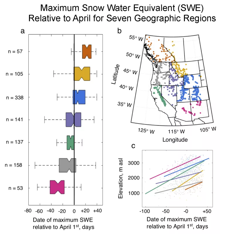
The date when snowpack reaches an annual maximum is often considered to separate the winter accumulation period from the spring melt season. Historically, April 1 has been used to approximate this date of maximum SWE. For over a century, seasonal water supply forecasts used by water managers and agricultural practitioners across the western United States have been produced on April 1. Data from nearly 1,000 snowpack stations across western North America (including those used on Snow Today) support this long-standing operational date—the long-term average date of maximum SWE is within a few days of April 1 (Figure 6). However, there is much geographic variability. On average, the snowpack of the California Sierra Nevada and inter-continental regions such as Idaho peak within a few days of April 1, while the snowpack in the US Pacific Northwest and Southwest peaks nearly a month earlier. In continental regions, including Colorado, Wyoming, Montana and the Canadian Rockies, the timing of maximum SWE occurs closer to May 1 (Figure 6). Generally, maximum SWE occurs earlier in warmer regions and at lower elevations and later in colder regions and at higher elevations.
As winter temperatures continue to rise in response to climate change, not only is snowpack declining in many regions but winter snowmelt is also increasing, causing the seasonal distinction between accumulation and melt seasons to be increasingly blurred. A new paper published this week and highlighted by the University of Colorado Boulder shows that increases in winter snowmelt since the 1980s are widespread and extend from Arizona to Alaska. More winter snowmelt will complicate future water resource planning and management.
Figure 6. The box plots (a) on the left show the date of maximum snow water equivalent (SWE) relative to April 1, measured at snowpack telemetry stations within seven geographic regions (colors) that are shown in the upper right map (b). The number (n) of stations within each region is indicated in the box plot (a). The box plots illustrate the peak SWE date using whiskers to show the tenth and ninetieth percentiles, colored boxes to show the twenty-fifth and seventy-fifth percentiles, and notches within the boxes to show the average values. The lower right plot (c) shows the average linear relationship between station elevation and the date of maximum SWE relative to April 1 for each of the seven geographic regions (colors). Points indicate station-specific, long-term averages used to fit a linear regression for each region shown in corresponding colors.
