SIPN
Snapshot of the Arctic
Explore Snapshot of the Arctic visualizations to track current conditions in Arctic sea ice and Arctic temperatures, and to follow long-term trends. This page was assembled by the Sea Ice Prediction Network for easy access to up-to-date information about the Arctic. It combines data visualizations and data products from NSIDC, NASA, the US National Ice Center (USNIC), the University of Washington, the Japan Aerospace Exploration Agency (JAXA), the Danish Meteorological Institute (DMI), the University of Bremen, and the Ocean and Sea Ice Satellite Application Facility (OSI SAF).
Wherever possible, current maps and graphs have been embedded directly into this Snapshot of the Arctic. In a few cases, to view the most recent data, you will need to follow a link.
Extent Maps
Explore these maps to see how much of the Northern Hemisphere is currently covered with sea ice, and to find the location of the ice edge.
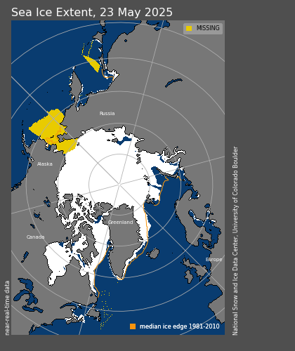
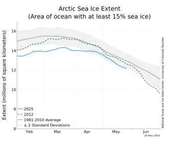
Arctic Daily Sea Ice Extent - NSIDC
NSIDC estimates sea ice extent based on measurements of sea ice concentration, which are expressed as a percentage. NSIDC sets a threshold of 15 percent. Where sea ice concentration is 15 percent or higher, NSIDC designates the area as ice-covered; where sea ice concentration is below 15 percent, NSIDC designates the area as ice-free.
Multisensor Analyzed Sea Ice Extent - Northern Hemisphere (MASIE-NH) - NOAA@NSIDC
MASIE uses daily operational ice charts drawn by USNIC analysts to identify the current edge of Arctic sea ice. The location of the ice edge often determines where activity in the Arctic is practical and safe. By precisely locating the sea ice edge, using the most recent full day of data, MASIE provides information that protects people and property in the region.

Concentration Maps
Sea ice concentration describes how much a particular place, such as a 25- by 25-kilometer area of ocean surface, is covered by sea ice. Concentration is typically reported as a percentage or a fraction. Use these maps to see where sea ice is concentrated in the Northern Hemisphere based on recent satellite data.
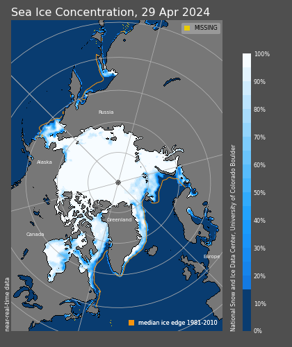
Arctic Daily Sea Ice Concentration - NSIDC
This map shows sea ice concentration across the Arctic Ocean and surrounding seas. Concentration is color coded, with high concentrations appearing in white or very light blue, and low concentrations appearing in darker blue. The map is composed from the most recent full day of observations.
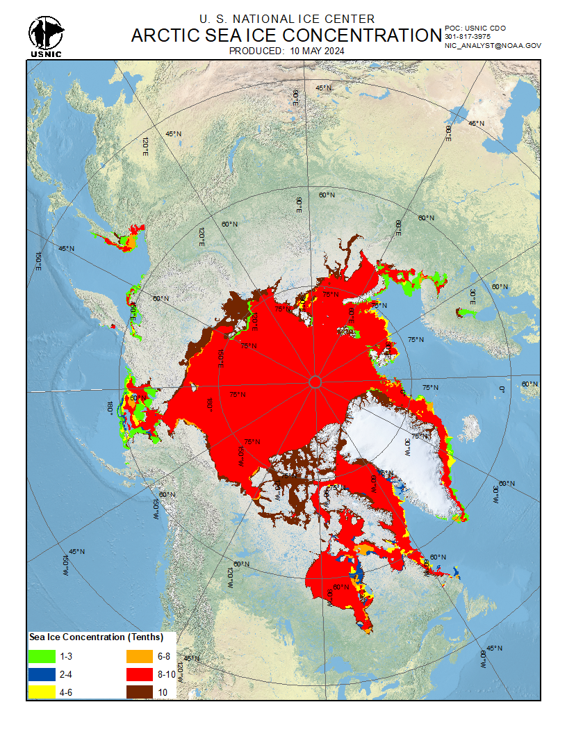
Arctic Basin Ice Concentration - Ice Logistics Portal
This color-coded map shows sea ice concentration expressed in tenths. Lowest concentrations appear in shades of green and blue, and highest concentrations appear in shades of red and deep red-brown. This map is updated weekly based on observations from the preceding days of the week.
Sea Ice Concentration - University of Bremen
This color-coded map shows sea ice concentration expressed in percentages. Low percentages are purple, middling percentages are gray, and high percentages are white. The map is derived from the most recent full day of observations.

Time Series
These graphs document changes in Arctic temperatures as well as sea ice area, extent, and volume over time. Most graphs plot months or days of the year along the horizontal axis, and provide a different trend line for each year.
Arctic Daily Sea Ice Extent - NSIDC
This graph shows Arctic sea ice extent: the area of the Arctic Ocean with at least 15 percent sea ice concentration. It shows the most recent few months of the current year’s extent trajectory, updated with the most recent full day of data. The graph also shows the 1981 to 2010 average ± two standard deviations and selected recent years for comparison with the current year. (To compare sea ice extent for all years since the start of the satellite record, check out NSIDC’s interactive Charctic tool.)
Arctic Sea Ice Extent and Area - NASA Goddard Bootstrap
These graphs show Arctic sea ice area and extent, updated weekly. Sea ice area is calculated by totaling sea ice concentration across the Arctic Ocean. Sea ice extent is calculated by setting a concentration threshold of 15 percent and considering everything above that threshold completely ice filled.

Arctic Sea Ice Extent - University of Bremen
This time series graphs the area of the Arctic Ocean with at least 15 percent sea ice concentration. It provides a trend line for the current year’s sea ice extent, updated with the most recent full day of observations. It also shows trend lines for selected recent years, along with the long-term average since 1972.

Arctic Sea Ice Extent - JAXA
This time series graphs the area of the Arctic Ocean with at least 15 percent sea ice concentration. It shows sea ice extent for the current year, updated with the most recent full day of observations. It also shows selected recent years for comparison, as well as decadal averages for the 1980s through the 2010s.
Note: The graph shown here is a snapshot from 2018.

Arctic mean temperatures north of 80°N, and Sea Ice Extent - Danish Meteorological Institute (DMI)
The Danish Meteorological Institute monitors weather, sea and ice in the Arctic for several reasons. Partly to follow the climatological development, partly to produce physical data products for numerical weather and sea models, and partly to support ships with the latest ice observations. Some of their free data visualizations include the following:
These graphs show Arctic sea ice volume calculated by the Pan-Arctic Ice Ocean Modeling and Assimilation System (PIOMAS). The Arctic sea ice volume anomaly graph uses a different horizontal axis than the other time series graphs shown here; rather than showing the dates of a single year, it shows yearly values since the early 1980s. The graph plots volume anomalies for each day relative to the average of the previous years for the same time of year. The daily Arctic ice volume graph uses a similar approach to the other graphs, but shows calculated ice volume rather than area or extent.
Note: Since the source URLs do not use https communication protocol, these images may not appear in some browsers.


Temperatures
Browse these maps to monitor sea surface temperatures across the Arctic Ocean.
Sea Surface Temperature, Sea Ice Concentration, other parameters - NASA Cryosphere Distributed Biological Observatory (DBO)
This color-coded map shows sea surface temperatures through the last full day of observations. Sea surface temperatures are shown only for open-water areas of the ocean, i.e., not covered by sea ice.

UpTempo Buoys - University of Washington
This color-coded map shows temperatures measured by the Measuring the Upper Layer Temperature of the Polar Oceans (UpTempO) system at the University of Washington. Observations are collected by ocean buoys, and maps are updated hourly.
Note: Since the source URL does not use https communication protocol, this image may not appear in some browsers.

Sea Surface Temperature and Sea Ice - JAXA AMSR2
This color-coded map combines sea surface temperatures, sea ice concentration, and snow depth into a single image. The color palettes at the bottom of the map show what the colors mean for each parameter.
Note: The map below is a data snapshot from December 2018.

Ice Drift
Even in the dark dead of polar winter, sea ice is constantly on the move, carried by winds and ocean currents. Explore these maps to see where sea ice is traveling.
Sea Ice Drift - OSI SAF
Maps from the OSI SAF indicate the direction and speed of ice motion. Longer arrows indicate faster motion. Purple arrows indicate movement interpolated from surrounding observations.
Note: The map below is a data snapshot from December 2018.

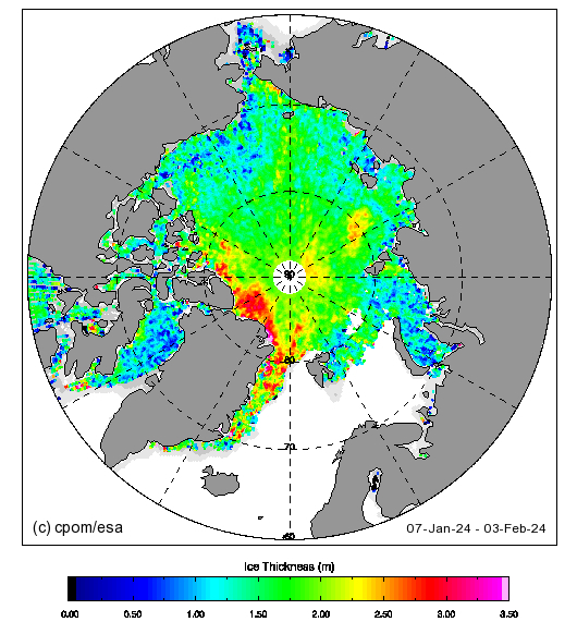
Thickness
Ice thickness contributes to the overall volume of ice in the Arctic and even affects sea ice behavior. Compared to thin ice, thick ice is typically older, less saline, and more resistant to melt. Use this map to examine ice thickness throughout the Arctic Ocean.
Sea Ice Thickness - University of Washington
This color-coded map shows where Arctic sea ice is thickest and thinnest. The map is composed from the most recent month of observations.
Note: Since the source URL does not use https communication protocol, this image may not appear in some browsers.