By Agnieszka Gautier
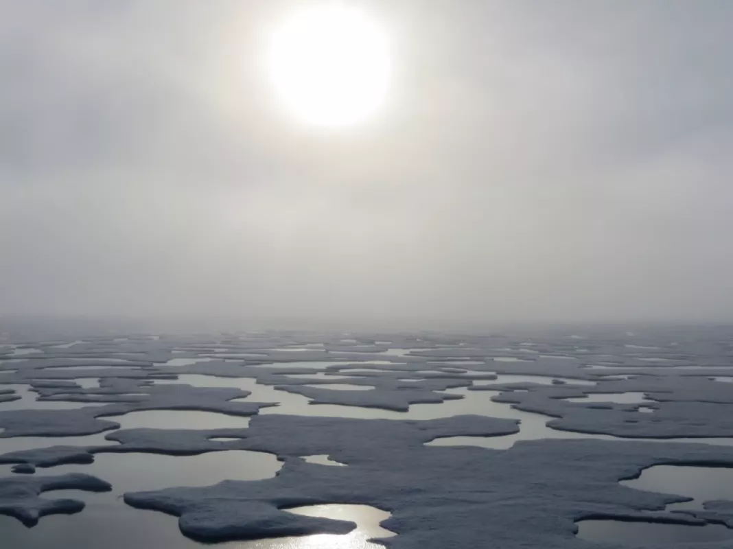
Sea ice plays a key role in Earth’s climate system. It drives heat and freshwater exchanges in the polar oceans. In the Arctic, sea ice acts like Earth’s refrigerator, reflecting the sun’s rays off of its white surface and back to space; thereby, cooling its surroundings. With 24-hour sunlight, the summers bring warmth and brightness, causing sea ice to dramatically retreat and reach its minimum in September. Each winter, sea ice expands under frigid and dark conditions, arriving at its maximum in March. And in recent years, both the sea ice minimum and maximum have set record lows: the 12 lowest sea ice minimums have all occurred in the last 12 years. Record winter lows also struck the Arctic from 2015 to 2017, with 2018 as a close second. Though weather patterns strongly drive short-term variations in extent, analysis of the satellite record back through 1979 suggests a long-term decline in Arctic sea ice.
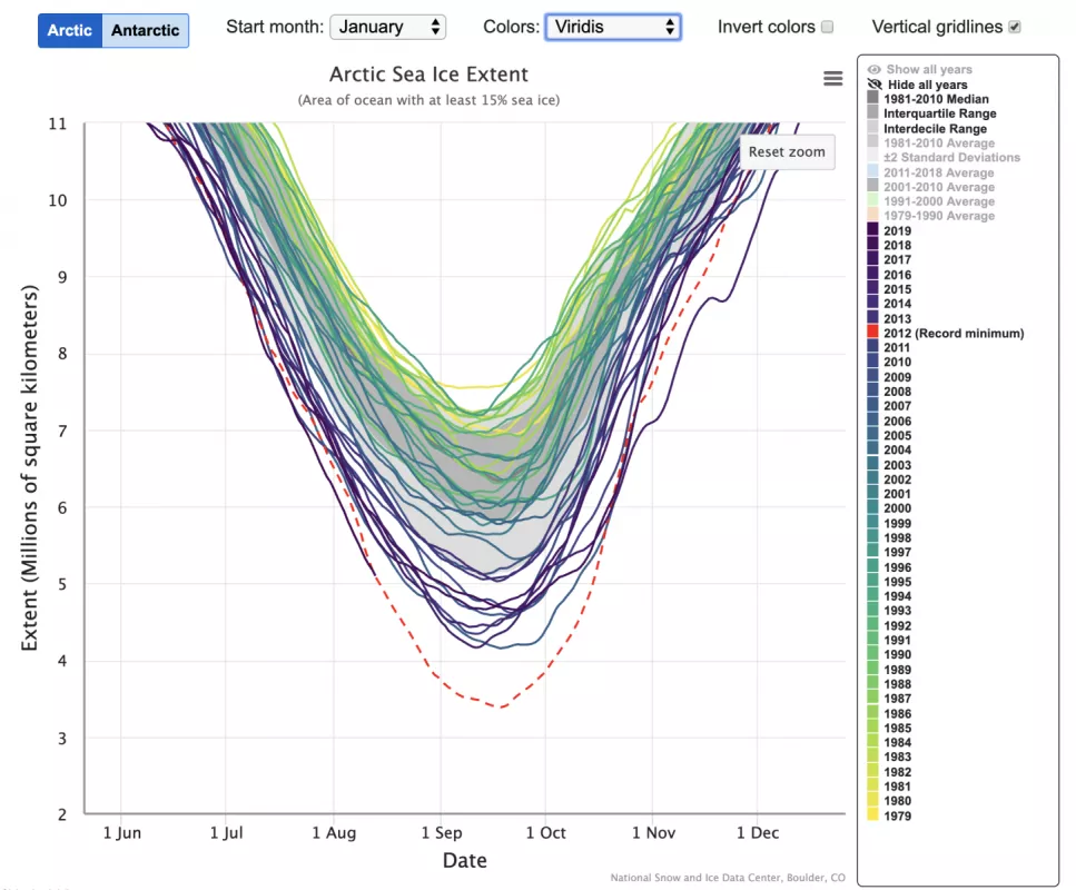
Sea ice trends are most apparent through data visualization. The human brain processes complex data faster and easier through visuals than poring over spreadsheets. In other words, visuals make data more accessible. That is precisely what NSIDC software developers had in mind when creating Charctic, the now ubiquitous graphic of sea ice decline, which launched in 2012 as a way to capture the story behind the data.
Record lows put NSIDC in the limelight
Arctic Sea Ice and Analysis (ASINA), home of Charctic, started as an ad-hoc science project after sea ice hit record lows in 2005 and 2007. After securing funding in 2008, ASINA became a routine NSIDC analysis. In the beginning, scientists showed decline through static graphics, selecting their own years of comparison, but public feedback prompted NSIDC to create a visualization tool that showed changes in Arctic sea ice more deliberately. Matt Savoie, an NSIDC software developer, had the idea to create a Google Finance for sea ice: a clean graph with data points that was interactive and easy to use. “Users wanted to interact instead of look at static plots, to be able to select their own years of comparison,” said Kevin Beam, another software developer who helped Savoie put the initial graph together. “We had three days to figure this out. Within a day or two we had a prototype.”
Charctic went live just after the 2012 sea ice minimum, the lowest extent on record. Since then, Charctic has had almost 3.3 million pageviews, and 664,000 users visiting the site. It has been used in newspapers like the Washington Post, climate websites like climate.gov, and appeared on various social media outlets like twitter.
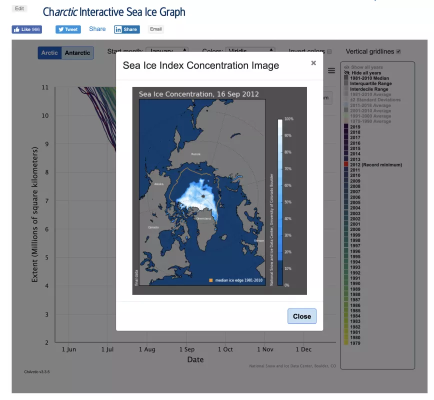
Charctic’s simplicity is part of its nature, but through the years it has had several facelifts. The ASINA team incorporated user feedback to improve usability. A zooming-in feature allows users to crop points of interest. Hovering features have been added to highlight the year, the exact date, the day of the year, and extent size. When a data point is selected, a map of sea ice extent concentration pops up to quickly visualize where the ice is disappearing. “For me it was a really fun project, and a number of developers have worked on it over the years,” Beam said. “I don’t think of it as mine, but ours. From the beginning it has been a team effort.”
Most recently, different colors have been added to Charctic to more clearly delineate the shrinking extent, which is best visualized when comparing decades. The timeline can also now be moved to start at various months. These changes allow users to visualize in different ways the same essential concept: a critical feature of our Earth is disappearing.
From abstract to subtract
NSIDC software developers incorporated Charctic design elements and usability to show changes in other parts of the cryosphere. For the Greenland Today analysis, they created a Greenland Surface Melt Extent Interactive Chart to visualize melt spikes during the summer. These visualization tools help tell the story of what is happening in remote parts of our planet. “When I look at data, I prefer to play with it and interact with the numbers because it gives me more of an intuitive feel,” Beam said. “The interactive portion of it helps me understand that this is a changing world and that I can actually see that directly.”
As sea ice disappears and the Charctic curve drops further down in summer, the implications for weather patterns, ecology, and Arctic communities have yet to be measured and calculated. When summers in the Arctic will be ice free is a matter of debate, ranging from as early as 2020 into the next century. In either case, Charctic makes that loss tangible.


