The Greenland Ice Sheet had a far more typical melt extent and intensity in 2013 than in 2012, when summer surface melting set a record, compared to satellite observations since 1978. After the normal winter hiatus, the 2014 melting season has now begun again along the southern Greenland coastal areas. We will review the early progress of the 2014 season in our next post, in mid-June.
Overview of conditions
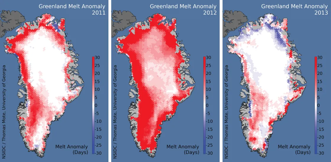
Figure 1 shows the cumulative number of days that the Greenland Ice Sheet experienced surface melting during 2013 (right image), along with comparison images for 2011 and for 2012, the record year for melt days. Overall, 2013 melt intensity, expressed as the number of melt days relative to the 1981 to 2010 average, was slightly to moderately higher than average in the southern and western Greenland Ice Sheet but unusually low along the northern and northeastern coastal areas. In particular, surface melt did not extend to the higher-elevation interior regions in the north as much as has been typical for the 1981 to 2010 period. A narrow band along the eastern coastline showed significantly greater than average melting, but here as well the surface melt conditions did not extend inland and uphill as they have in recent years.
Conditions in context
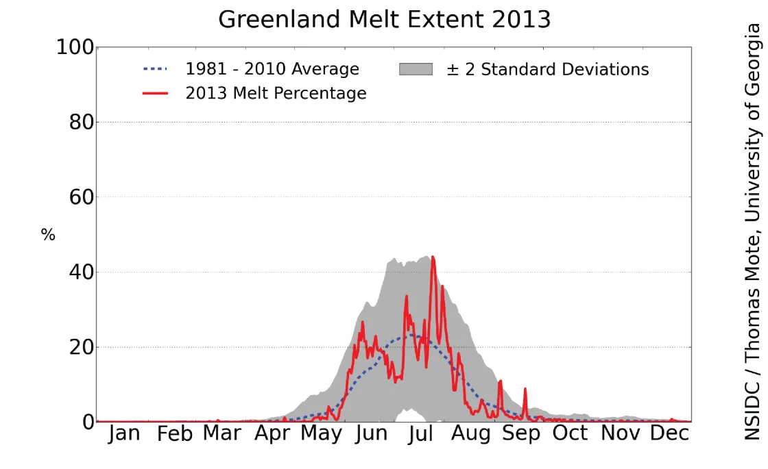
In contrast to 2012, the extent of melt was also closer to average during 2013, compared to the period 1981 to 2010. Extensive melting began slightly later than usual, toward the end of May, but increased rapidly to above-average levels by mid June. A brief reduction in late June and early July was followed by a late-season re-advance in melt area in late July.
2013 compared to previous years
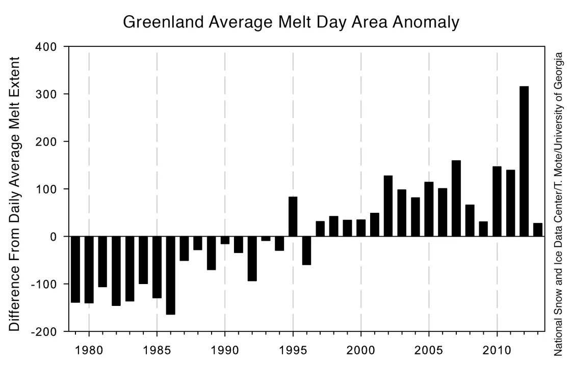
The 2013 summer in Greenland also saw a reversal of the recent trend in summertime loss of surface snow and ice mass by run-off, as would be expected given the reduced melting. Figure 3 illustrates the relative melt area departure from the average (sum of the daily melt areas over the ice sheet for June, July, and August in each year, with the average area for 1978 to 2013 subtracted). The very large increase in 2012 is clearly shown, as is the return during 2013 to conditions typical of the late 1990s.
Climate conditions during 2013
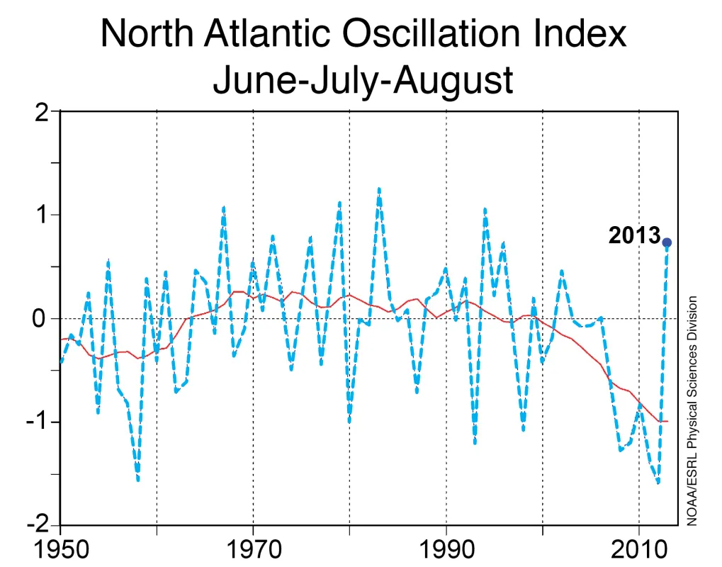
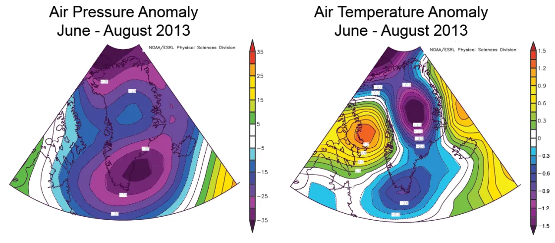
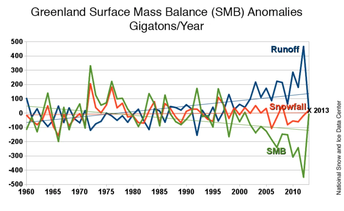
Weather patterns were significantly different over Greenland during 2013 compared to 2012, when high temperatures led to extensive melt. A dominant Arctic climate pattern, the North Atlantic Oscillation (Figure 4), was in its positive phase for the summer months (June through August) of 2013, sharply contrasting with a trend that had held for the previous six summers. As discussed in NSIDC Arctic Sea Ice News and Analysis on September 17, 2013, the positive phase of the NAO favors anticyclonic circulation over Greenland. The NAO generally produces warm and dry conditions over Europe and is associated with cooler and higher-precipitation conditions in Greenland and the central Arctic. Consistent with this, lower-than-average air pressures (Figure 5, left) were observed over Greenland during the 2013 summer, as well as lower temperatures (Figure 5, right). Air temperatures over Greenland were 0.5 to 2 degrees Celsius (1 to 3.6 degrees Fahrenheit) below the 1981 to 2010 averages. Precipitation was also higher in summer 2013. Figure 6 shows the pattern of total snowfall anomaly (the amount of snowfall relative to the average amount for 1980 to 1999); the meltwater runoff anomaly (the amount of mass lost to water runoff relative to the 1980 to 1999 average); and the net balance between snowfall and runoff (and evaporation of snow, a minor component of loss) called the surface mass balance (SMB), as calculated by the MAR regional climate model. Highlighted in this graphic are the major ice mass losses of the twelve years preceding 2013. Note that this accounting does not include ice that flows directly into the sea by glacier movement.
Pale by comparison
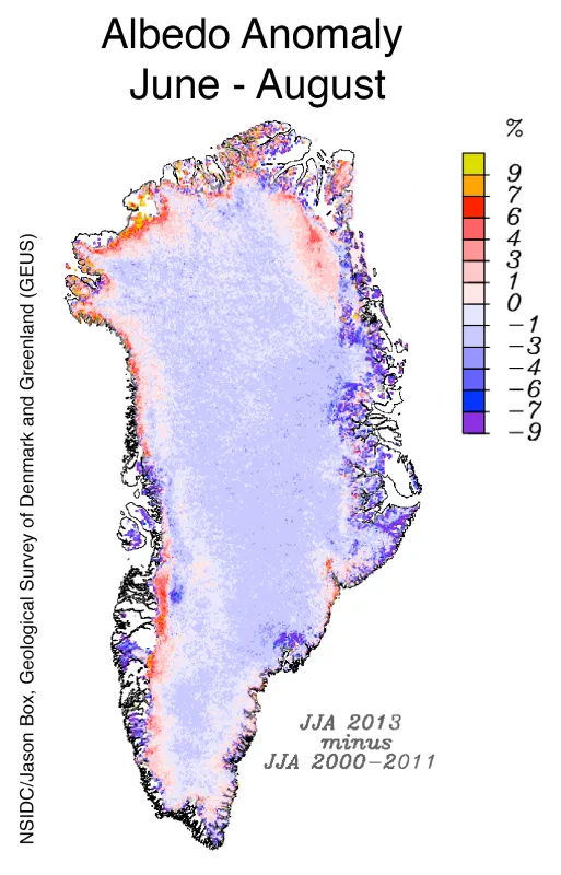
During summer 2013, the albedo of the Greenland ice sheet surface was higher along the coastal part of the ice sheet than in recent years, indicating less wet snow and snow-free bare ice areas (ablation areas) along the ice sheet perimeter. Reflectivity is highly variable on an ice sheet: dry snow is the brightest surface cover, above 85% reflectivity, (or, expressed on the 0 to 1 scale, albedo); wet snow has an albedo of about 0.6 to 0.8; coarse wet snow and slush is about 0.4 to 0.5; impurity rich bare ice with no snow cover has an albedo of 0.3; and clear deep water is near 0.10. As fresh snow ages, the grains become coarser and the albedo drops by as much as 10%. Melting in the snowpack has an even more dramatic effect, lowering reflectivity by up to 20%. With less exposed bare ice near the coasts, the solar reflectance of these regions is higher than the recent average. In the interior, during 2013 summer snowfall events were widely spaced in time over the ice sheet interior, and so the snow surface tended to be older and therefore a bit darker than average.
More to come
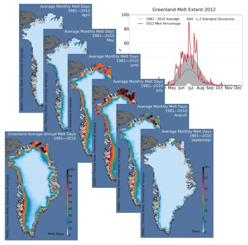
Our next post will examine the early progress of the melt season. In the interim, new supporting data sets and analysis tools have been derived from the melt extent archives that will present a more complete picture of the melt season in 2014. Several new data sets and graphic upgrades were generated since late September 2013. These changes are summarized in Figure 8 and include an analysis of a 30-year record of daily melt extent spanning the climatological reference period 1981 to 2010, as measured by the Mote melt algorithm (Mote, 2007). The 1981 to 2010 average is shown as a blue dashed line, and the gray area around this average line shows the two standard deviation range of the data. Annual and monthly average melt day maps were also generated, allowing an assessment of the impact of weather events and the trends of melt extent and intensity in various areas. Resources for analysis of trends and variations for the Greenland Today website will continue to expand as funding permits. We aim to build an interactive analysis tool similar to our Sea Ice Index webpages and to make daily data available as with the Sea Ice News and Analysis web pages. We are presently working on a table of results for the melt days and extents.
References
Fettweis, X., 2007. Reconstruction of the 1979-2006 Greenland ice sheet surface mass balance using the regional climate model MAR. The Cryosphere, 1, 21-40, https://doi.org/10.5194/tc-1-21-2007. See also: https://www.aoncadis.org/dataset/CPL_MAR.html.
Hall, D. K., G. A. Riggs, and V. V. Salomonson. (2006). MODIS/Terra Snow Cover 5-Min L2 Swath 500m, Version 5 [Data Set]. Boulder, Colorado USA. NASA National Snow and Ice Data Center Distributed Active Archive Center. https://doi.org/10.5067/ACYTYZB9BEOS
Mote, T. L., 2007. Greenland surface melt trends 1973–2007: Evidence of a large increase in 2007. Geophysical Research Letters 34, L22507, https://doi.org/10.1029/2007GL031976.
Acknowledgements
We would like to thank Xavier Fettweis of the University of Liege, Belgium, and Jason Box of the Geological Survey of Denmark and Greenland (GEUS) for their contributions to this post.
