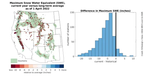
Figure 6. The left map shows the maximum snow water equivalent (SWE) values recorded up until the start of April 2022 versus the long-term average maximum SWE values measured at stations in the western United States (minimum 25 years). The warm colors indicate stations where the 2022 maximum SWE was less than the long-term average SWE, while cool colors denote stations where the maximum SWE recorded in 2022 was greater than the long-term average SWE. Note that the color bar at the bottom is not symmetrical and has different increments across the warm and cool colors to represent the values best visually in the map. The right chart shows the same data as the left chart tabulated as a bar graph by the number of stations corresponding to each SWE difference magnitude. — Credit: Mark Raleigh, Oregon State University
