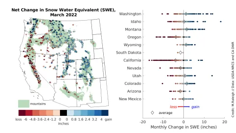
Figure 5. The left map shows the net change in snow water equivalent (SWE) in inches during March 2022. Blue indicates a net gain (more snowfall than snowmelt) and red indicates a net loss (more snowmelt than snowfall). Note that the color bars at the bottom are not symmetrical and have different increments across the warm and cool colors to represent the values best visually in the map. The green shading delineates mountainous areas as represented in Environmental Protection Agency (EPA) data. The right chart shows the monthly SWE changes recorded at the stations in each state in circles and corresponding state averages in diamonds. Notably, these stations are not necessarily indicative of the true state averages because they are not distributed evenly in space or elevation. — Credit: Mark Raleigh, Oregon State University
