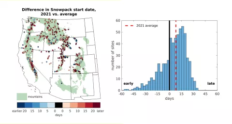
Figure 6. This figure shows the 2021 date of snowpack initiation at the snow monitoring sites as a difference from average. In the left map, blue markers indicate locations where snowpack started earlier in 2021 than average, while red markers indicate snowpack started later in 2021 than average. Only sites with at least 25 years of identified snowpack onset date are included. The right chart summarizes the same data as a bar graph. Bins to the left of the thick vertical line depict an early snowpack development relative average, while bins to the right depict a development later than average in 2021. The red dashed line is the average across the snowpack monitoring network. — Credit: M. Raleigh, Oregon State University
