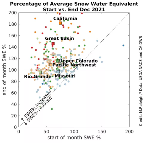
Figure 5. This graph shows snow water equivalent (SWE) at monitoring sites in the western United States at the start (x-axis) versus end (y-axis) of December 2021. SWE is expressed as percent of average conditions at each site. Stations are shown as colored circles, with the HUC-2 basin average shown as a larger square with the same color. The average is computed only from stations reporting SWE at both the beginning and end of the month. Regions above the dashed line indicate greater SWE percentage at the end of the month, while regions below the dashed line show greater SWE percentage at the start of the month. — Credit: M. Raleigh, Oregon State University
