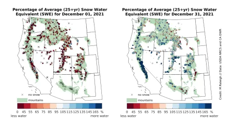
Figure 4. The left map shows snow water equivalent (SWE) at monitoring sites at the start of December 2021, and the right map shows SWE at the end of December 2021. SWE is expressed as percent of average conditions at each site, with warmer colors indicating below average SWE, or less water in the form of snow, cooler colors indicating above average SWE, or more water, and white areas indicating average SWE. The green shading delineates mountainous areas as represented in Environmental Protection Agency (EPA) data. — Credit: M. Raleigh, Oregon State University
