• NSIDC's website will undergo planned maintenance on Wednesday, January 15, from 10 a.m. to 12 p.m. (U.S. Mountain Time). During this time, the NSIDC.org website and most NSIDC data access may be briefly unavailable.

Feature Story
  • Glaciers
  • Ice shelves
  • Sea ice

There and back again: the IceFlow data tool

IceBridge Antarctica
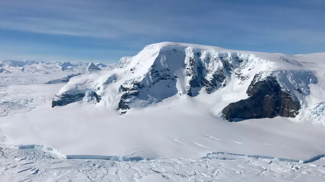
Mt. Balfour lies on the western side of the Antarctica Peninsula. The terminus of the Fleming Glacier is visible in the foreground of this photograph. — Credit: NASA Operation IceBridge

By Agnieszka Gautier

It only takes a small uptick in temperature for Earth’s frozen regions, known as the cryosphere, to go from freezing to thawing. Scientists have been able to measure Arctic sea ice thinning, the Greenland Ice Sheet losing mass, and glaciers losing volume using lidar instruments. Lidar shoots a laser light on a target and the time it takes to return to the sensor becomes a measurement of distance. After acquiring these data points, a high-resolution map of surface heights emerges.

NASA has been using lidar to measure the cryosphere since at least 1993, first on an aircraft, and then on a satellites. The altimetry data, or elevation data, shows just how much ice sheets, glaciers, and sea ice have changed. There is only one problem: how to use the data for a time-series comparison.

Since the original Airborne Topographic Mapper (ATM) lidar sensor was first put on a plane many updates have improved this system. “Every time you make changes, though, you learn better ways of representing the data, leaving you with a trail of different formats,” said Steve Tanner, a data manager for the National Snow and Ice Data Center (NSIDC) Distributed Data Active Archive (DAAC). ATM, for instance, stores its data in seven different formats spanning 25 years. To see meaningful information, all the data needs to first be put into a common format. “For a lot of researchers, that’s too daunting of a task,” Tanner said.

With support from NASA, the NSIDC DAAC now offers a solution in the form of an interactive tool called IceFlow. With IceFlow scientists can access lidar data all the way back from 1993 to the present. IceFlow harmonizes and standardizes years of lidar data so scientists can analyze significant changes using a uniform format. “We want to move the data closer to the scientist,” said Luis Lopez, a software engineer responsible for building IceFlow.

The lidar journey

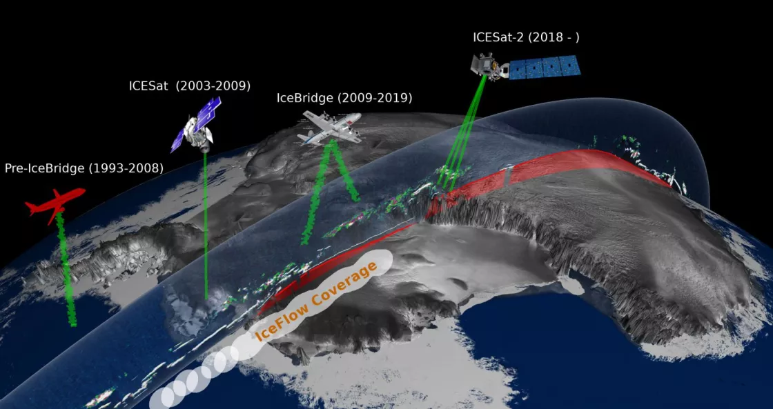
IceFlow coverage via satellites and their dates
This graphic shows the timeline of IceFlow data coverage, using lidar data from various NASA campaigns and satellites as early as 1993. — Credit: NASA

The lidar instrument has had quite a journey. In 1993, NASA deployed ATM to take measurements over the Greenland Ice Sheet. The aircraft flew at an altitude between 400 and 800 meters (1,300 to 2,600 feet), mapping the ground below to an accuracy of 10 centimeters (4 inches).

In 2003, NASA placed a similar instrument on a satellite, the Ice, Cloud, and land Elevation Satellite (ICESat), launching it into space to measure ice sheet mass balance, cloud and aerosol heights, and land elevation. It provided polar coverage, but before its 2.0 version could be deployed, it had to be decommissioned after its primary instrument failed in 2008. The follow-on ICESat-2 was not due to launch until 2018.

To fill the gap, from 2009 to 2019, the ATM lidar sensor was placed again on aircraft to support Operation IceBridge, the largest airborne survey of Earth’s polar ice ever to fly. Multiple instruments detailed the Arctic and Antarctic areas to better understand their connection to the global climate system. Hundreds of flight lines exist with altimetry, atmospheric, magnetic, gravitational, and other data meant to provide continuous coverage of major cryospheric features.

ICESat-2 launched in September 2018 and will continue collecting data for years to come, sending 10,000 laser pulses per second to measure the elevation of ice sheets, sea ice, and forests in unprecedented detail. It takes measurements every 71 centimeters (28 inches) along the satellite’s path to an accuracy within 4 millimeters (0.16 inches).

Once ICESat-2 launched, older ATM and ICESat data needed to become more pronounced, giving rise to IceFlow. By storing the ATM and ICESat data in a point-cloud database and extracting the requested data in an HDF5 format, IceFlow provides direct access to the older data rather than making users download original file formats. It means replacing an unwieldy file system with direct data points. “It’s a real game changer,” Tanner said.

IceFlow uses a Jupyter notebook, an open-source web tool to provide the primary interface. It allows users to select data over both spatial and temporal ranges, order the data for download, and create data visualizations. This framework is widely used in the data science community. “It’s a live document to make science reproduceable,” Lopez said. “It allows users to see the results right away.”

On your mark, get set…

Beyond formats, however, NSIDC programmers faced another challenge with the data: plate tectonics. Earth’s crust consists of roughly 20 moving tectonic plates, shifting land masses an average rate of 15 millimeters (0.6 inches) a year. “Over the course of this data, for instance,” said Tanner, “Greenland moved a meter from where it used to be.”

Altimeter satellites use Earth’s center of mass as a stable reference point. But Earth is not perfectly round. Squished at its poles, it is more like a lumpy potato than a sphere. Scientists, therefore, use a theoretical sphere, a geoid, to map Earth’s land and ocean under the influence of gravity. Earth’s gravity, however, does not pull equally because the planet is not perfectly spherical or uniformly dense. Global Position System (GPS), other Earth observational systems, and satellites depend on the International Terrestrial Reference Frame (ITRF) to maintain accuracy.

For decades, scientists have been refining the ITRF, a constellation of fixed reference points used to define Earth’s shape. Mathematical computation from lasers, satellites, and radio telescopes converge to compare measurements and edit out errors. ITRF is the heart of elevation data accuracy.

If meaningful comparisons are to be made, the geolocation differences need to be reconciled. Since the launch of ICESat, the ITRF had been updated three times. IceFlow standardizes the coordinate reference systems and applies all geophysical corrections to the data, allowing data users to do research faster.

Data trailers

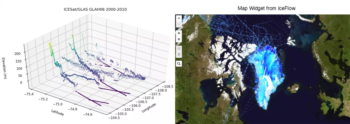
mapping tools in IceFlow
The left graphic is a three-dimensional visualization of terrain elevation spanning several years and multiple NASA missions from a single IceFlow data granule. This eliminates the need to download multiple files from different sources. On the right is the map widget on a Jupyter notebook that shows the flight paths from Operation IceBridge. It also visualizes where the IceFlow data is going to be and where it is going to be denser. — Credit: NSIDC

Best of all, users can preview and interact with the data before hitting the download button. Data visualization and code come together in a single document—a user can learn about the data, access the data through an interactive map widget, format it or zoom in, select any data from missions, add corrections, and choose a time frame. Nothing needs to be downloaded or installed on the users’ personal computer because the data is stored in the cloud and can be interacted with on that level.

Considering the size of this data, this is a huge advantage. “The data are big,” said Steve Tanner. “We are talking about sending trillions of data points in the case of ICESat-2 down to Earth and back again.” If a user is only interested in a small area of Greenland, why download the entire file structure over Greenland? So NSIDC took care of this subsetting capability: using a polygon allows a user to zoom in on an area and access a smaller set of data points.

Even that, however, can get tricky. NSIDC does not have the cloud resources to store data for a major glacier or greater area over decades. Curious, Lopez tested the Jakobshavn Glacier, a fast-changing glacier in western Greenland, for all available years, and the single file ended up being 8 gigabytes.

Something the IceFlow team hopes to improve is ways of providing manageable, yet accurate data. This is called data dissemination. Users do not need the finest level of granularity to understand the overall change to Jakobshavn Glacier. For instance, if a single grid has 100 points in a meter, the data dissemination could do an average or offer half of the points because the big picture would not change, but the file size would be manageable.

That is the main goal in the end. As Lopez said, “We’re trying to lower the barrier for scientists. When scientists come to our product, we don’t want them to spend hours just trying to understand the data. Let’s get them started faster so they can do their research.”

For more information

Visit IceFlow

View data from ICESatICESat-2, and IceBridge