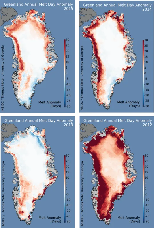
Melt extent in Greenland was above average in 2015, ranking 11th highest in the 37 year record from satellite data. Overall, climate patterns favored intense melting in the north and northwestern parts of the ice sheet, and relatively cool conditions in the southeast.
Overview of conditions
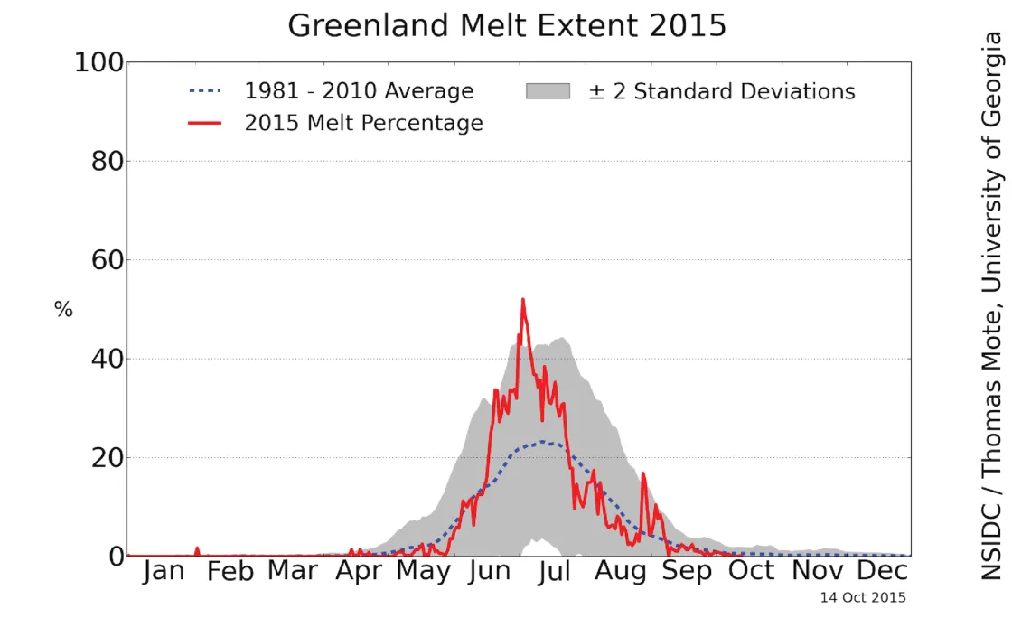
Surface melt extent on the Greenland Ice Sheet in 2015 was greater than average in northwestern and northern Greenland, and average to below-average levels along the western and southeast coast. The main features of the 2015 season were a slow start, with cool conditions in central and southeastern Greenland in June, a surge in melting in late June and all of July as very warm conditions prevailed along the far northern and northwestern coast, and an average August pattern, with a late surge of southeastern melting at the end of the month extending into early September. At the peak in early July, over 50% of the ice sheet experienced surface melting.
Conditions in context
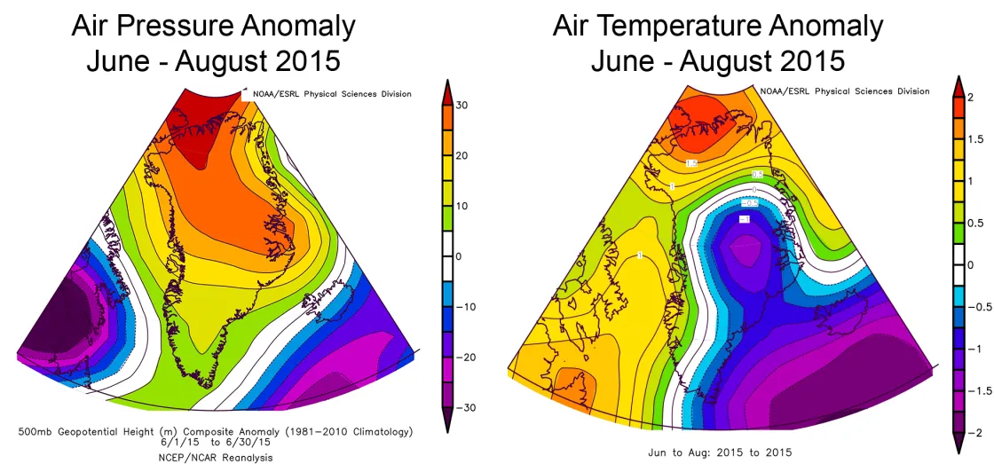
Weather conditions averaged over the summer months of June, July, and August (compared to 1981 to 2010 averages for the same months) revealed a higher-than-average pressure over the island again, as has been the case for several recent summers. For 2015 the pressures were most above average along the northern Greenland coast and across to Ellesmere Island. This was also an area of above-average temperatures, up to 2° Celsius (4° Fahrenheit) higher than usual, and was the site of the most frequent melting this year as well. However, much cooler conditions prevailed in central Greenland and along the southeast coast (approximately 1° Celsius, or 2° Fahrenheit, below average), consistent with the lower-than-average melt extent in this area. The most significant weather period was the warm spell during late June and most of July, when southerly winds along the western coast drove temperatures up to 4° Celsius (7° Fahrenheit) above average near Thule in northwestern Greenland.
Greenland in 2015 compared to previous years
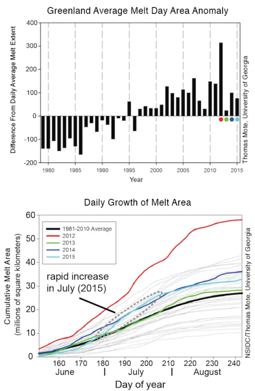
The 2015 total summer melt extent area (the sum of the area of surface melt for each day for June, July, and August) was the 11th largest in the period 1978 to 2015. While higher than the 37-year average, 2015 was fairly typical for the past decade’s summers in Greenland. Comparing the seasonal progression of the four most recent years, the recent tendency for greater-than-average melt extent is apparent. This plot also shows the rapid increase in total melt area seen in July, increasing at a rate similar to the record melt year 2012. Greenland’s 2015 melt extent area total was approximately 85,000 square kilometers (32,800 square miles) above the 1981 to 2010 average.
Reflections on the season
The animated series of images (in the video below) shows average albedo (surface reflectance, 5-day running average) of Greenland from June 12 to August 31, 2015. Anomalies are compared to 1981 to 2010 averages. Data are from the NASA MODIS/Terra Snow Cover Daily L3 Global 500m Grid, Version 5 data set, available at the National Snow and Ice Data Center. Images courtesy Jason Box/GEUS.
The reflectivity of Greenland’s ice sheet surface (bare ice, dry or wet snow, and in some areas wet snow and ice with dust, soot, and embedded microbes), when compared to a reference average of 2000 to 2009, tells us additional details about the 2015 melt season. The season began with cool, dry, snowy conditions (average to brighter-than-average surface) along the southwest and eastern coast in mid-June, and then developed widespread surface melting along the western and northwestern coast (7.5 to 15% darker than average) by the end of June. Melting and exposure of soot and dust on the surface peaked in the first half of July along the entire northwest and northern coastline extending well into the ice sheet (widespread areas of 15% below-average reflectivity) and then stopped relatively abruptly around July 20 to 25th as fresh snow fell over much of the island (raising the brightness of the surface to near-average levels). At the end of August, there was a brief warm spell, and the surface darkened along the southeastern coast for a short period.
Ice in the balance
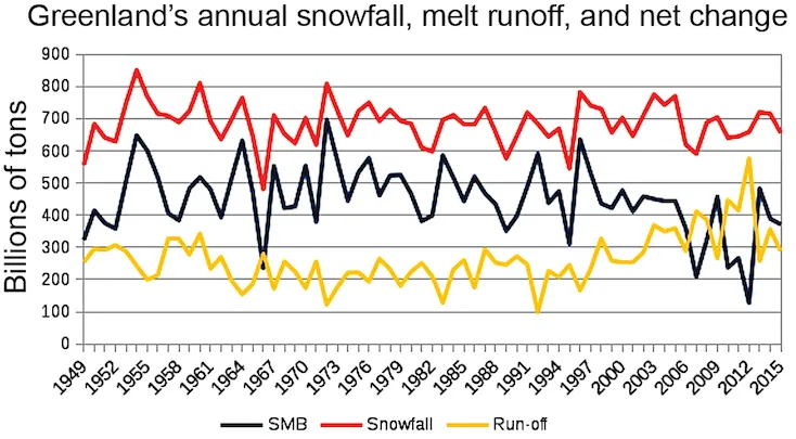
Using a model (MAR) of the Greenland Ice Sheet climate that is driven by a retrospective reanalysis of weather conditions (NCEP-NCAR v1), a record of the total precipitation and melt runoff can be generated for the past 67 years. While not perfectly accurate, it gives a good overview of the trends of snowfall, and melting, for the island. The difference between the two represents the surface mass balance for the ice sheet (mass that is deposited by snow accumulation minus the mass that flows away as water runoff). This is called the surface mass balance in glaciology, because it does not include the component that flows away as glacier ice. The analysis shows that snowfall has changed very little over the past several decades, but surface melting and runoff tended to increase beginning about fifteen to twenty years ago, resulting in some reduction in the net amount of snow left on Greenland to contribute to glacier flow. The summer of 2015 had only slightly greater meltwater runoff than average, and near-normal snowfall totals.
Chasing the snowline uphill
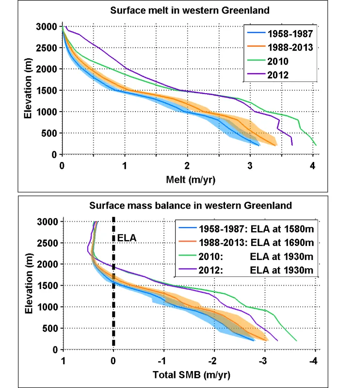
A recent study of change in the extent of melting in western Greenland, and its potential effects on glacier ice flow, shows that loss of ice by surface melting has climbed uphill on the Greenland ice sheet in recent decades. When water drains through the ice sheet and lifts part of the ice off the bedrock, it can cause the ice to flow faster. If this process were to expand uphill into new areas of the ice sheet, it could significantly affect the ice flow. However, a key step is that the water requires a pathway, usually a crevasse, to reach the base of the ice. The study suggests that at elevations above 1,600 meters (5,200 feet), there are very few crevasses, and the stress on the ice is too low to generate many new crevasses. This argues that a runaway process earlier thought to be a key part of eventual major losses of Greenland’s ice sheet is probably not as severe as once thought.
Further reading
Poinar et al., 2015, Limits to future expansion of surface-melt-enhanced ice flow into the interior of western Greenland, Geophys. Res. Lett., doi:10.1002/2015GL063192.
