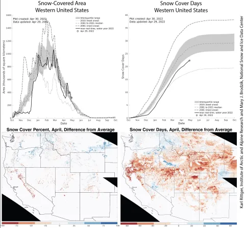
Figure 2. The upper left graph shows the total snow-covered area over the western United States in relation to the 22-year satellite data. The lower left shows snow cover percent as a difference between an average year and April 2022. Warm colors indicate below-average snow-covered area, cool colors indicate above-average snow-covered area, and white areas indicate little variation from the average. The upper right graph shows snow cover days over the western United States in relation to the 22-year satellite data. The lower right shows snow cover days as a difference between an average year and this year, summed from October 1, 2021, to April 30, 2022. Warm colors indicate below-average snow cover days, cool colors indicate above-average snow cover days, and white areas indicate little change from the average number of snow cover days. — Credit: Karl Rittger, Institute of Arctic and Alpine Research and Mary J. Brodzik, National Snow and Ice Data Center
