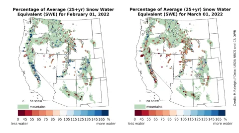
Figure 6. The left map shows the snow water equivalent (SWE) values measured at monitoring sites at the start of February 2022; the right map shows SWE at the beginning of March 2022. In the maps, SWE is expressed as a percentage of the average conditions recorded at each site. Warm colors indicate below-average SWE, or less water in the form of snow; cool colors indicate above-average SWE, or more water within the snowpack; and white areas indicate average SWE. The green shading delineates mountainous areas as indicated in Environmental Protection Agency (EPA) data. — Credit: Mark Raleigh, Oregon State University
