Learn
Quick facts, basic science, and information about snow, ice, and why the cryosphere matters
The cryosphere includes all of the snow and ice-covered regions across the planet. Explore our scientific content about what makes up this frozen realm, its importance to Earth's people, plants and animals, and what climate change means for the cryosphere and the world at large.
Pick an area of interest
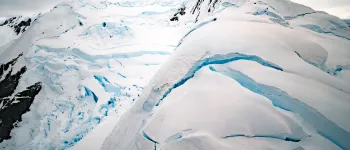
What is the cryosphere?
This section is your introduction to the frozen parts of our planet. Learn where the cryosphere lies and how it influences life on our planet. Dive deeper into each feature below.
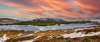
Arctic weather & climate
The Arctic is known as Earth's refrigerator. Land surrounds a cold ocean, which is covered by a thin layer of perennial sea ice and snow. How do these white surfaces affect weather and climate, both global and regional?
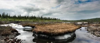
Frozen ground & permafrost
More than half of all the land in the Northern Hemisphere freezes and thaws every year, while a quarter of the land has an underground layer that stays frozen all year long. How has life learned to thrive in such a harsh environment?
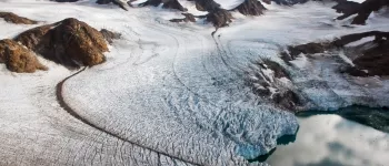
Glaciers
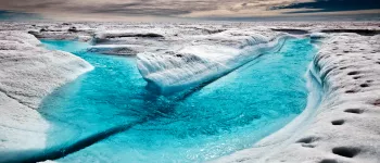
Two categories of glaciers exist: ice sheets and alpine glaciers. Ice sheets cover vast areas of land in broad domes. Alpine glaciers, are smaller, and found not only at the poles, but in high mountain regions across the globe.
Ice sheets
During a series of Pleistocene Ice Ages, vast areas of our planet were covered by land. As the planet warmed, about 12,000 years ago, the ice sheets retreated to two major land areas, Greenland in the Northern Hemisphere and Antarctica in the
Ice shelves
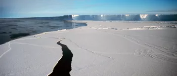
This part of the cryosphere is an extension of land ice that spreads out over cold ocean waters. Since they are key in regulating glacial movement, they are an indirect, yet critical component to sea level rise.
Sea ice
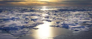
When the surfaces of bodies of water reach their freezing point, layers of ice form. Sea ice is unique in that the water must be colder than fresh water to freeze. As such, the polar regions are cold enough to allow sea ice to form.

Snow
When most people think of the cold parts of Earth, they think of snow. Snow is much more important to the planet than simply for recreational purposes. Learn how it impacts wildlife, communities, and the global climate.

Ask a scientist
Visit this area to read common questions that have been asked of our scientists and staff. Feel free to suggest your own question.

Cryosphere glossary
Words matter and their meanings even more so. Search for a specific word or browse the many interesting words characteristic of the cryosphere.
You might be interested in our scientific analyses and news
Sea Ice Today
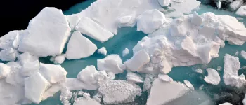
View near-real-time data images of sea ice conditions in both polar regions and explore a rich archive of scientific analyses from 2006-2025.
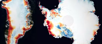
Ice Sheets Today
Track annual surface melt conditions on Earth's polar ice sheets and read scientific analysis from our international collaborators.

Snow Today
Read seasonal analysis of snow conditions in the western United States and explore a variety of near-real-time data on snow.
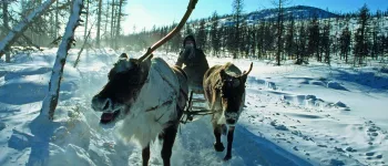
News and Stories
Discover how NSIDC research and data at NSIDC are being used to make a difference across the planet and how you can use our data and resources for your own projects.

Photo and Video Galleries
Witness the beauty of Earth's disappearing features, captured by NSIDC staff and partners.

Ask a Scientist
Read common questions that have been asked of our scientists and staff. Feel free to suggest your own question.