How to visualize NetCDF data in EASE-Grid/EASE-Grid 2.0 projection in Panoply
This tutorial outlines the steps for visualizing data in EASE-Grid/EASE-Grid2 projection and NetCDF format, using the free software, Panoply.
The Panoply data viewer can be downloaded from the NASA Goddard Institute for Space Studies web page here. This tutorial uses a NetCDF file from the Lagrangian Snow Distrbutions for Sea Ice Applications data set as an example.
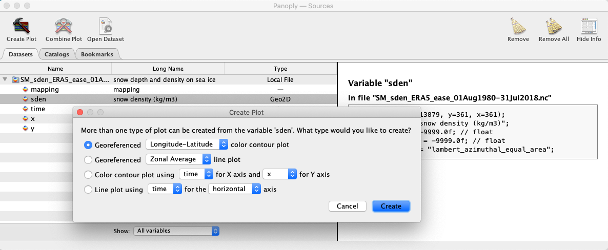
- Open the NetCDF file in Panoply and highlight the variable you wish to plot and select the 'Create Plot' button in the top left. In the dialogue box that opens, select the first option 'Georeferenced Longitude-Latitude color contour plot' and click 'Create'.

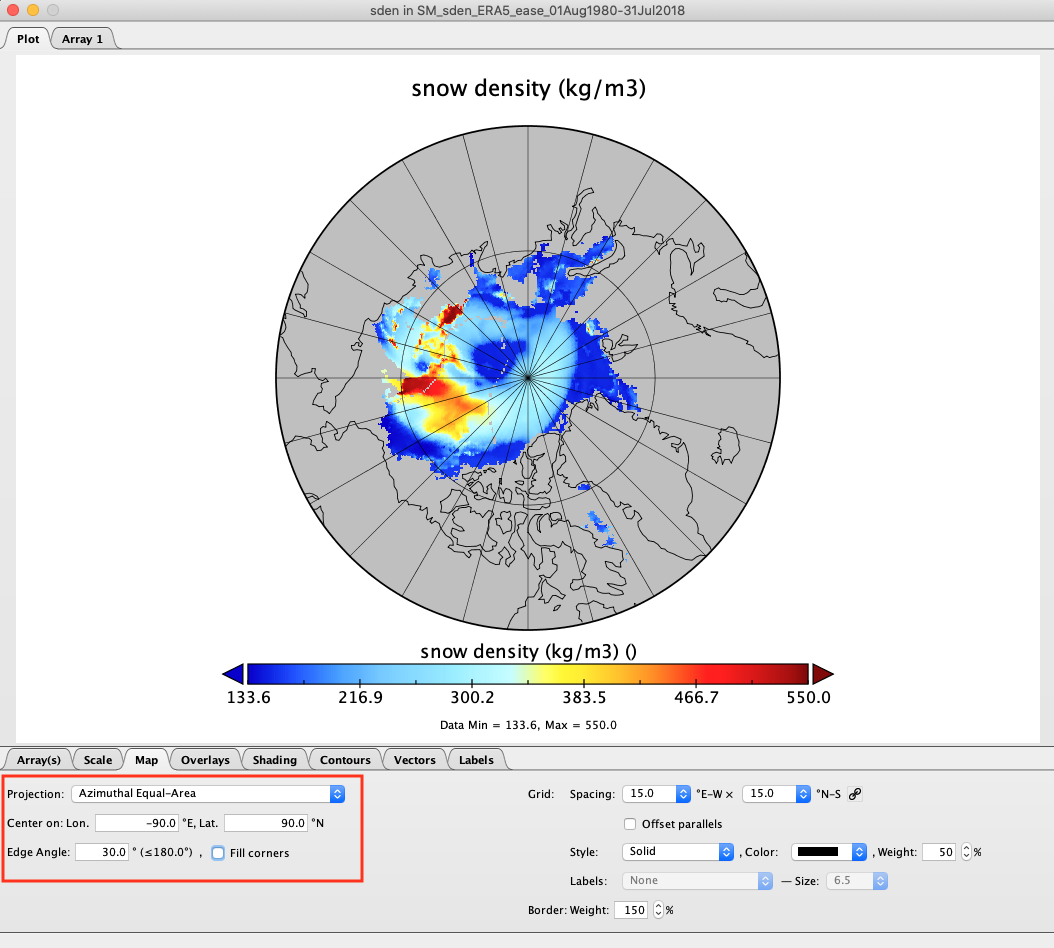
- In the new window that opens, select the 'Map' tab, and set the options as follows (as highlighted by the red box in the image below):
Projection: Azimuthal Equal-Area
Center on: Lon. -90 E
Center on: Lat. -90 N
Edge Angle: 30
Uncheck the 'Fill corners' option

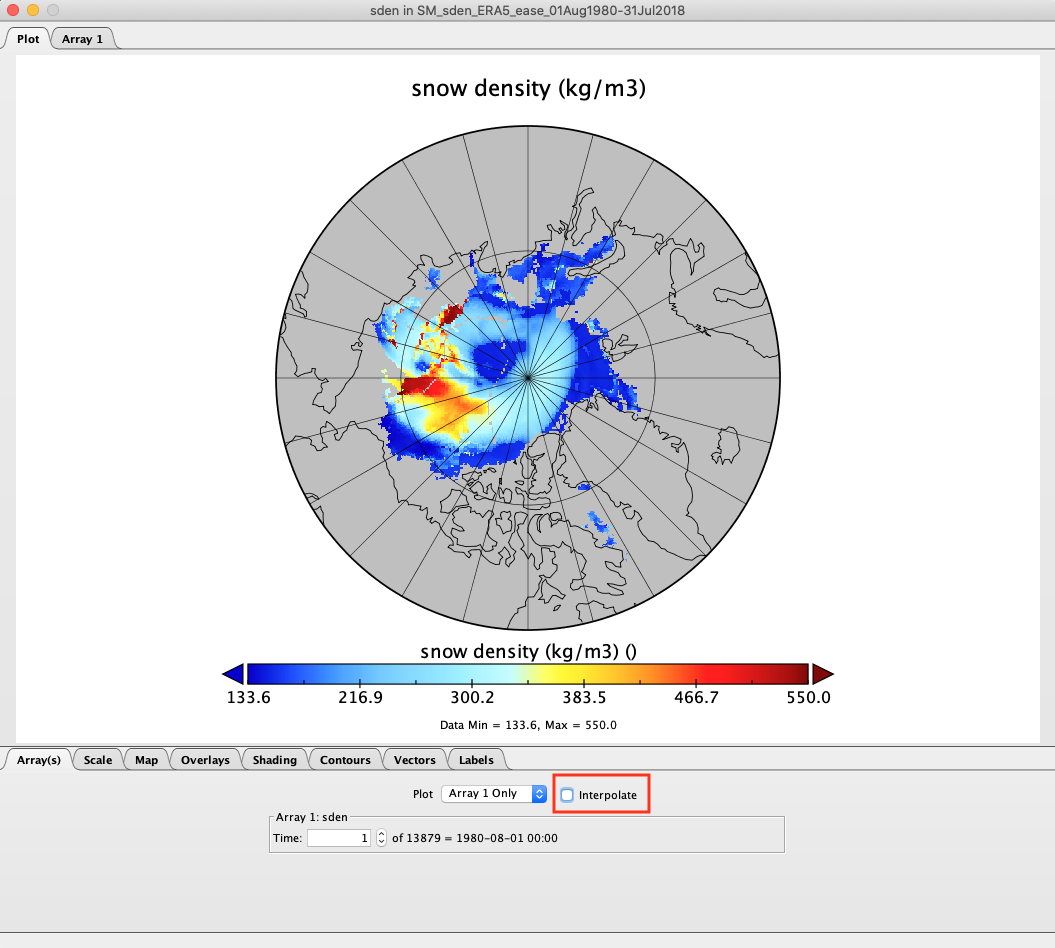
- Under the 'Array(s)' tab, uncheck the 'Interpolate' button (highlighted by the red box in the image below).

- You can save your plot using 'File' > 'Save as' and select the file format you require.
Note: For data sets that contain more than one time step in a variable, if the min/max values vary significantly between each time step then you may want to refresh the scale range so that it fits the data for that time step. This can be done by clicking on the 'Scale' tab and clicking 'Fit to Data' button.