Update, April 19, 2012: The nine-day trailing average climatology on the daily data graph has been changed to a five-day trailing average, to be consistent with the five-day trailing average for the daily data.
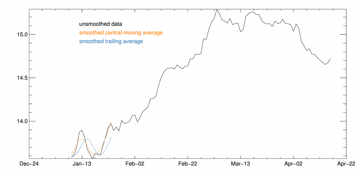
Figure 1. The graph above shows sea ice extent data graphed using the old method, a five-day centered mean (orange line), and the new method, a five-day trailing mean (blue line). The black line shows the raw daily data. In the old averaging method, extrapolated data sometimes changed values when sea ice extent was changing trajectory. The new method solves this problem by averaging only observed values.
Click for Animation
NSIDC has updated our processing of the daily sea ice extent graph. NSIDC calculates daily extent using a five-day average of the data. Previously, this average was a five-day centered mean, meaning that the final two days of data in the series were extrapolated from the previous three days.
The new method takes the average of the previous five days, so that readers will see fewer “wiggles” in the tail end of the data series (see animation, left). The value of the trailing mean lags the actual data values, so sea ice values will appear lower when ice extent is increasing, but will appear larger when ice is decreasing. The climatology is a 9-day running mean rather than a 5-day, so the climatology line also shifts slightly with this change.
While the averaging changes the data points on the graph, the underlying data remain unchanged. This change does not affect the monthly average data, which scientists use for longer climate comparisons.
NSIDC will be making further improvements to the Sea Ice Index graphs and images in the coming months. Sea ice data processing methods are described in detail in the Sea Ice Index Documentation.

