By Agnieszka Gautier
To get a sense of the magnitude of Arctic sea ice change, a click of a button reveals a map showing what a satellite sees and has seen since 1979. Nowadays, this visual is so accessible that it can be easily taken for granted. Getting here, however, took decades.
CD-ROMS, those pre-pressed optical compact discs, once distributed Arctic sea ice concentration data for the National Snow and Ice Data Center (NSIDC). And prior to archiving NASA satellite data and becoming one of the twelve NASA Distributed Active Archive Centers (DAACs), NSIDC analyzed sea ice extent from analog microfilms, which scientists had to scrutinize to map sea ice extent. “You needed to be an expert to work with that data,” said Walt Meier, the NSIDC DAAC scientist. Over the years, access to sea ice information has become easier, particularly through the NSIDC Arctic Sea Ice News & Analysis (ASINA) website, which provides regular scientific analyses of Arctic sea ice conditions since 2008.
A new visualization tool, the Sea Ice Analysis Tool, has just been added to ASINA that helps users customize the satellite data further, creating graphs or maps that show changes based on their chosen criteria. “This tool allows for lots of flexibility,” Meier said. Giving the public access to control the criteria is quite innovative and generous in terms of data visualization.

Memory lane
In the 1980s and ‘90s, the public only got updates when a scientist published trends for Arctic and Antarctic sea ice extent. “And scientists did that relatively infrequently. Before the late ‘90s, that was not a big deal, but then we started to see some changes,” Meier said. In the late 1990s, the sea ice extent minimum, which is reached annually in September, started to get more attention in the research community. News spread as record minimums in annual Arctic sea ice extent became more extreme and more frequent. In particular, the 2007 and 2012 ice decline got a lot of press, boosting public interest.
Questions trickled into NSIDC: How does sea ice in the Chukchi Sea compare this year to earlier years? Is there more ice or less ice than average in the Beaufort Sea? To provide answers, a NSIDC scientist needed to take the time to plot the data into a map. “If you are a sea ice scientist, then you could quickly plot something,” said Florence Fetterer, a NSIDC scientist and one of the founders of the Sea Ice Index, a data visual component to the NASA gridded-sea-ice satellite data. “But for everyone else, it was not easy to see what was happening in the Arctic.”
Fetterer, along with Ken Knowles, a former NSIDC software developer, envisioned a website that offered readily accessible, convenient information on sea ice trends and anomalies, or changes from a long-term average. As a NOAA liaison, Fetterer secured NOAA funds for this endeavor and the first Sea Ice Index prototype, published in 2002, showed ice trends back to 1987. At this point images were only updated monthly. In 2004, the next version went as far back as 1978, but it was not until 2012 that daily extent images became available.
A marriage of convenience
In 2008, the NASA Cryospheric Program funded ASINA on a long-term basis, allowing NSIDC scientists to contribute analyses regularly, and permanently integrating the Sea Ice Index into ASINA. The first ASINA posts used simple static graphics. Pre-selected years compared sea ice decline to an overall average. Before 2010, NSIDC scientists used a 1979 to 2000 average, but statistically speaking a 21-year average is not an ideal comparison. The standard climatology, or long-term average, is 30 years because this can smooth out multiyear variability and calculate a better representative average. NOAA used the 1971 to 2000 climatology, but NSIDC did not have data that far back and could not create a 30-year climatology until 2010. At that point, NOAA switched to the 1981 to 2010 climatology, and NSIDC followed suit.
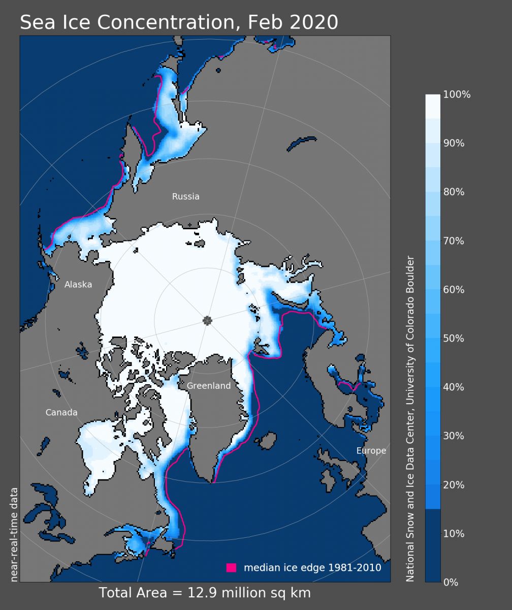
Those early static graphics, however, had limitations. Public feedback prompted the team to incorporate a visualization tool to better show significant changes in Arctic sea ice. Charctic, the interactive ASINA graph that shows the annual cycle of winter sea ice growth and summer decline, went live just after the September 2012 sea ice minimum—the lowest extent on record. Since then, Charctic has had almost 3.3 million pageviews, and 664,000 users, any number of whom could have viewed the page multiple times. As its popularity grew, the ASINA team added new elements to ease usability. A zooming-in feature crops points of interest. Hovering features highlight the year, the exact date, the day of the year, and extent size. When a date is selected, a map of sea ice extent concentration pops up to visualize where the ice is disappearing. Standard deviation and quartile and interquartile limits were also added, but the map visuals are limited and the climatology is stationary.
When ASINA switched from the 1979 to 2000 climatology to the 1981 to 2010 climatology, some users did not approve. “When you take out two early years, which have higher extents from the average and you add ten low years like 2007, your average shifts to a lower number, and then the differences look less severe,” Meier said. “Users complained that we were washing out the change. That was certainly true to some degree, but the switch didn’t fundamentally change the story of declining Arctic extents.” NSIDC wanted to stick with the standard other agencies were using to align with their data. NSIDC documented this change.
A brave new view
After NSIDC switched the climatology, users still wanted to compare to those earlier years, like 1979 to 2000. The new Sea Ice Analysis Tool, which has been two years in the making, allows users to actually do that. “Our data has slowly evolved to give users more control,” Meier said. The latest ASINA tool allows users to interactively analyze the data in the Sea Ice Index. “The Sea Ice Analysis Tool is meant to be interactive and to compare different reference and average periods. For instance, you could compare a decade to the 1979 to 2000 average,” Meier said.
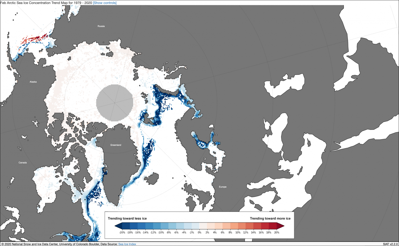
Not only can a graph display a trend that compares that trend to a given averaged period, the maps also show anomalies, or differences from the average, that were not available otherwise. Charctic, for instance, does not show the anomalies. That is something scientists or expert users would have to do on their own, and it would take a long time. The Sea Ice Analysis Tool offers four map views for sea ice: extent, concentration, concentration anomalies, and concentration trend. Each map can zoom into a specific region. The tool also has an extent anomaly graph, which shows how sea ice extent varies year to year, relative to the selected average period, or climatology, for a particular month. All these visuals are free, accessible, and reproducible. “It takes a lot of time to be able to come up with these visuals from the data,” Meier said. “Now we offer a flexible and dynamic tool that saves researchers and other users time. If you want to see what has been going on in the Bering Sea the last two years and compare them to other years, now you can easily do that.”
Explore sea ice visualization further
Sea Ice Analysis Tool
Charctic
NOAA Sea Ice Index
Explore the data behind the visuals
NASA Sea Ice Concentration from Passive Microwave Data
NASA Near-Real-Time Daily Polar Gridded Sea Ice Concentrations