By Agnieszka Gautier
Observing sea ice from space is sometimes tricky. Water vapor in the atmosphere makes seawater look like ice. Coastlines covered with ice make nearby ocean look iced-over, a problem called land-ocean spillover. Scientists adjust for such misinterpretations by creating masks based on previous sea ice conditions to conceal problem areas and highlight areas they know contain valid ice. The masks need to be adjusted for other factors, too, such as shifting sea ice patterns or varying orbit angles between different satellites. At NSIDC, scientists recently discovered their sea ice masks for passive microwave satellites could use a fresh update.
Ice adjustment
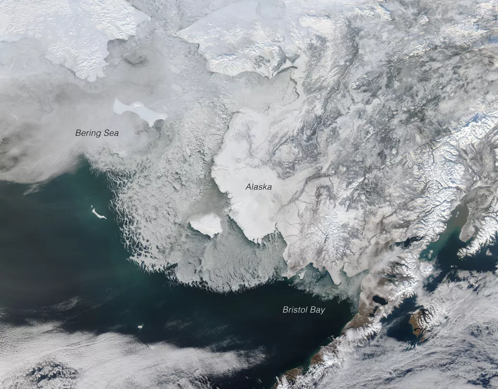
Sea ice in the Bering Sea is more extensive in recent years, but since the old masks were created using maximum ice extent data collected before this trend, they were missing valid ice. NSIDC scientist Julienne Stroeve said, “We noticed we were cutting off ice in the Bering Sea. We were expecting more sea ice in that area from winter through May.” In other areas of the Arctic, the masks were adding erroneous ice. Correcting those errors was time consuming. It meant scrutinizing individual pixels to adjust the masks and re-apply them. Regular tweaks made record keeping complicated, and that made sharing the masks with other researchers more difficult. But now, NSIDC has created new masks that are both more accurate and readily available. NSIDC data manager Donna Scott said, “These new masks give us even more confidence in the data and they have better provenance. We know exactly how they were created and they’re well documented, so there’s much more transparency for the user.”
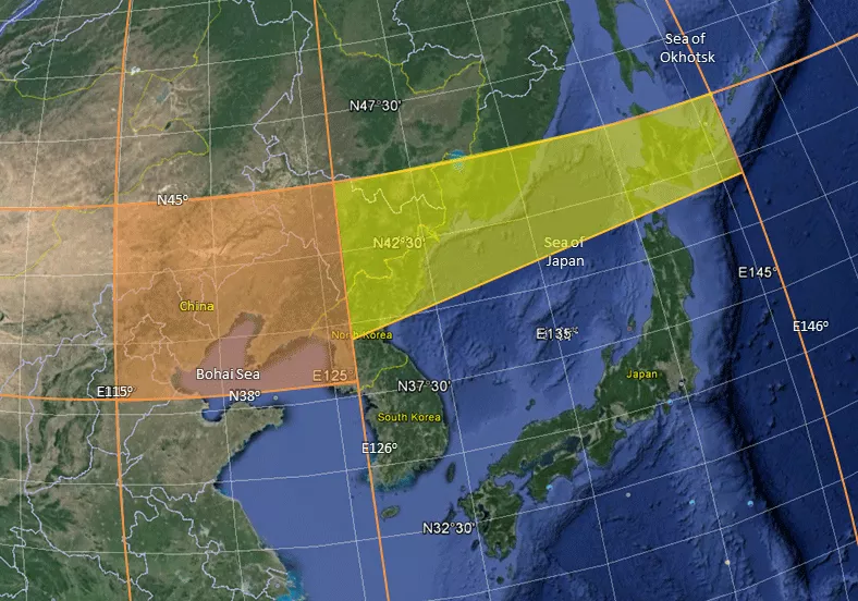
The new masks also set more realistic boundaries for where sea ice has historically been present. Previous masks had been based only on satellite data, but the new masks are based on National Ice Center (NIC) Arctic Sea Ice Charts and Climatologies. NIC charts and climatologies draw from multiple sources, such as ships and buoys, as well as satellites. Records for those sources extend as far back as 1972, six years before the satellite-based sea ice record began. And NIC sea ice analysts create each chart by painstakingly interpreting the ice in each pixel. Yet there was still room for improvement, the team found. Stroeve said, “NIC didn’t extend as far south [in the Northern Hemisphere] as we needed, so we expanded the masks.” The new masks, called the Polar Stereographic Valid Ice Masks Derived from National Ice Center Monthly Sea Ice Climatologies, bring previously unaccounted portions of sea ice into view in the Bohai Sea, the Sea of Japan, and the Sea of Okhotsk.
Closing gaps
The new masks have streamlined the suite of NSIDC passive microwave sea ice data sets. Before, NSIDC used separate masks for each data set. Scott said, “The process is much more systematic now because we have one set of masks that we can apply to several data sets.” Scott’s team also updated the sea ice suite to close a gap near the North Pole. Satellites in polar orbits, like those in the Defense Meteorological Satellite Program (DMSP), are tilted slightly away from the poles, so they do not pass directly over them. This means there is a small area called a pole hole that the instruments cannot view. However, the newest DMSP instrument, the Special Sensor Microwave Imager/Sounder (SSMIS), is tilted closer to the pole than its predecessors, the Scanning Multichannel Microwave Radiometer (SMMR) and the Special Sensor Microwave Imager (SSM/I). SSMIS can therefore observe more sea ice. As a result, data sets like the popular Sea Ice Index, which tracks Arctic- and Antarctic-wide changes in sea ice, now include approximately 300,000 square kilometers of additional coverage for the Northern Hemisphere. And like the new sea ice masks, these updates come with detailed records that provide a clear history for data users. Stroeve said, “We’re improving the data and we’re also being transparent about what we’re doing with the data.”
More information
Fetterer, F., K. Knowles, W. Meier, and M. Savoie. 2002, updated daily. Sea Ice Index. Boulder, Colorado USA: National Snow and Ice Data Center. http://dx.doi.org/10.7265/N5QJ7F7W.
Meier W., J. Stroeve, F. Fetterer, M. Savoie, and H. Wilcox. 2015. Polar Stereographic Valid Ice Masks Derived from National Ice Center Monthly Sea Ice Climatologies. Boulder, Colorado USA: NASA DAAC at the National Snow and Ice Data Center. http://dx.doi.org/10.5067/M4PUJAQRI2DS.
National Ice Center. 2006, updated 2009. National Ice Center Arctic sea ice charts and climatologies in gridded format. Edited and compiled by F. Fetterer and C. Fowler. Boulder, Colorado USA: National Snow and Ice Data Center. http://dx.doi.org/10.7265/N5X34VDB.

